Typeface Design
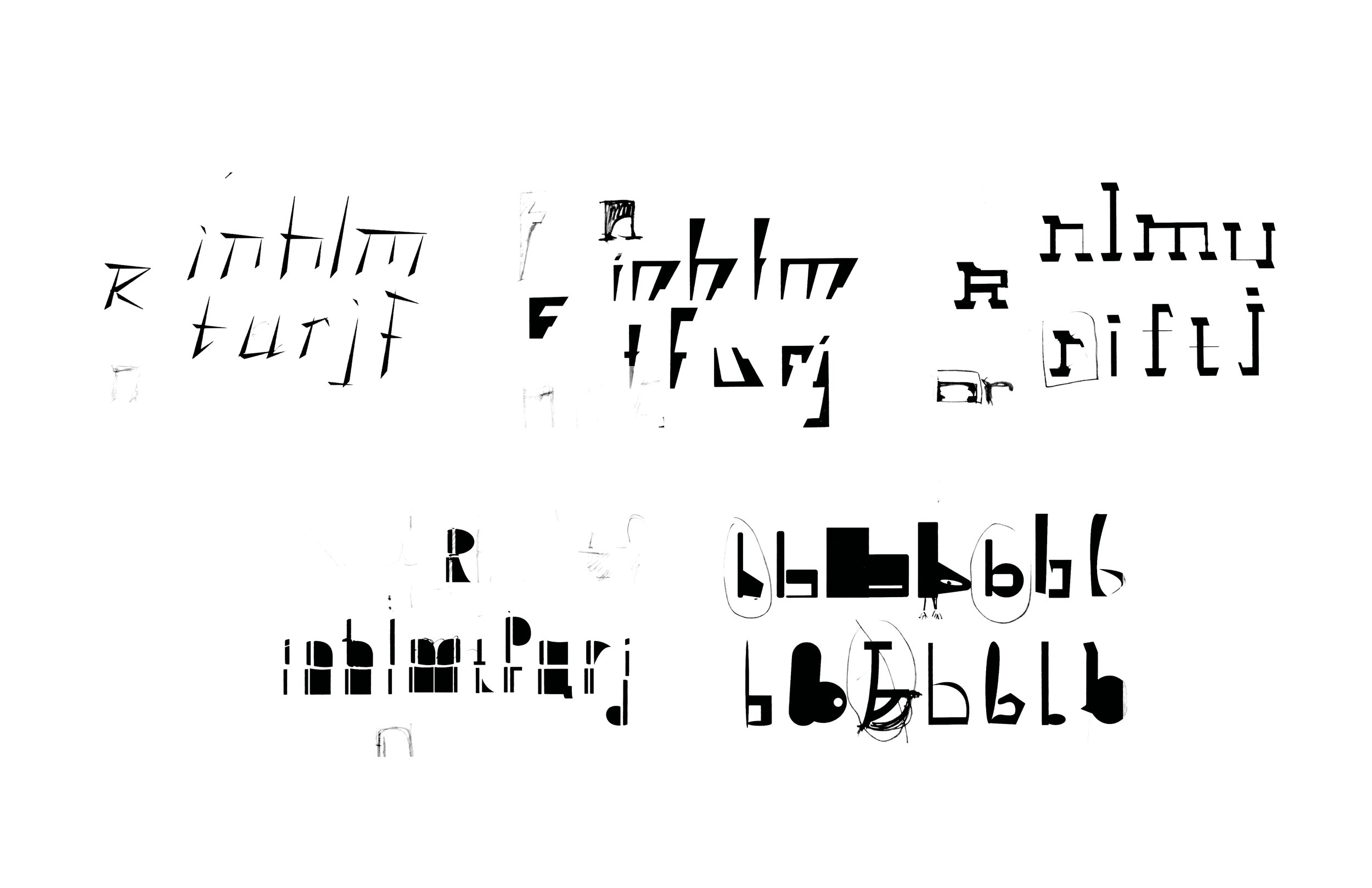
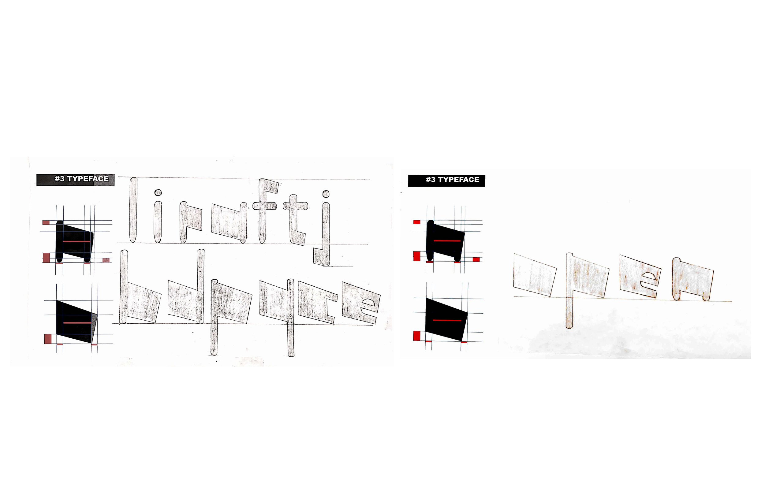
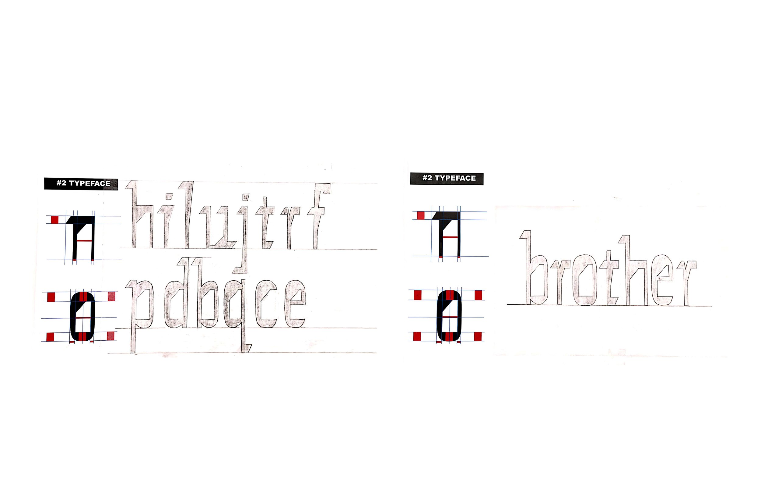
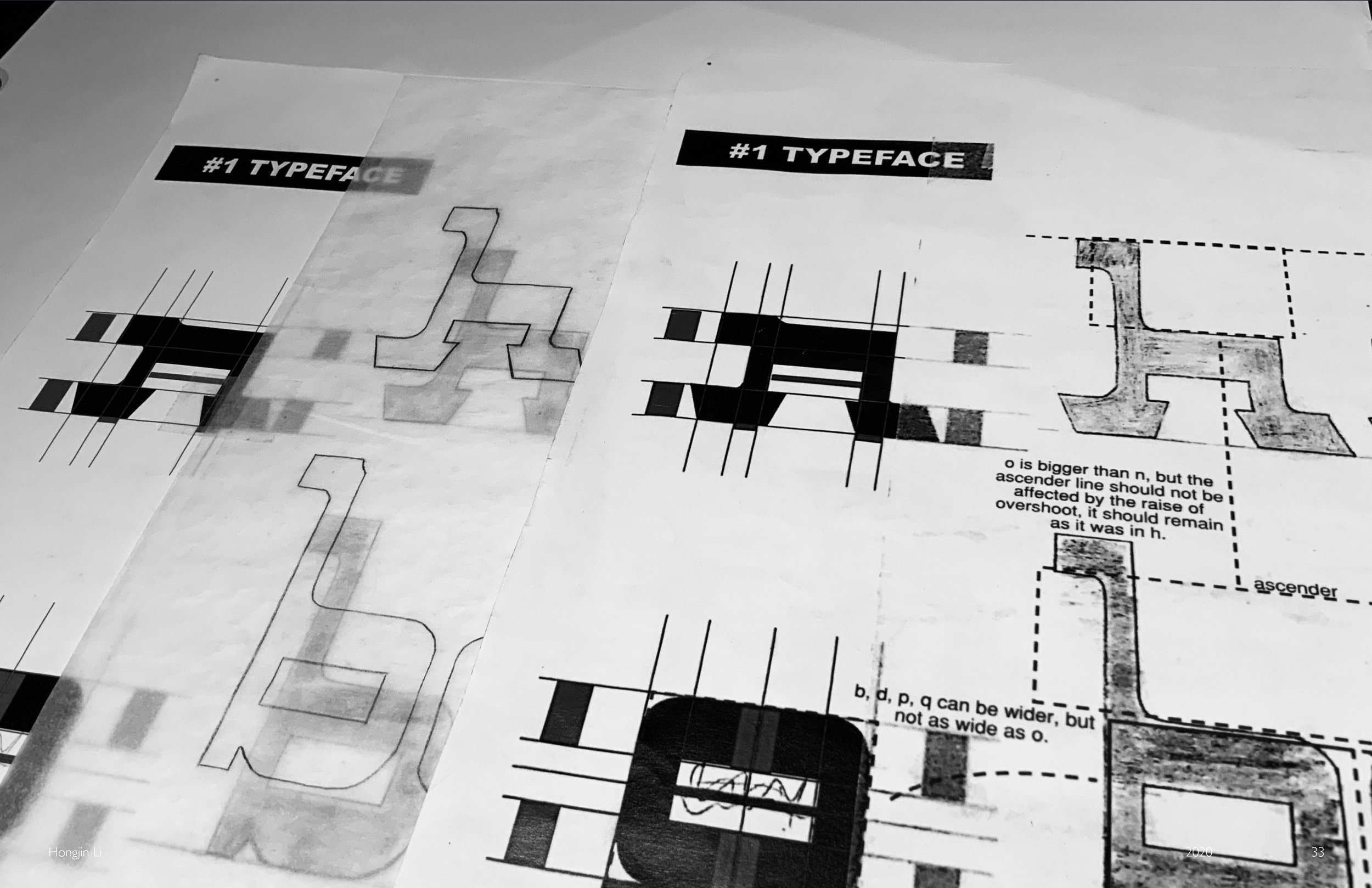
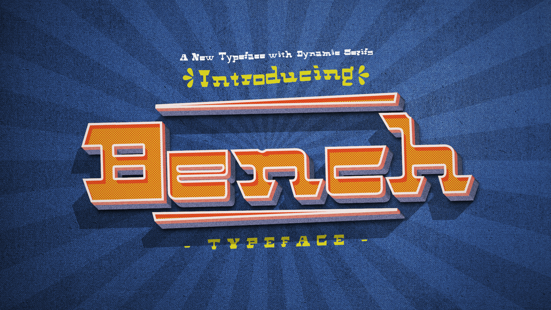
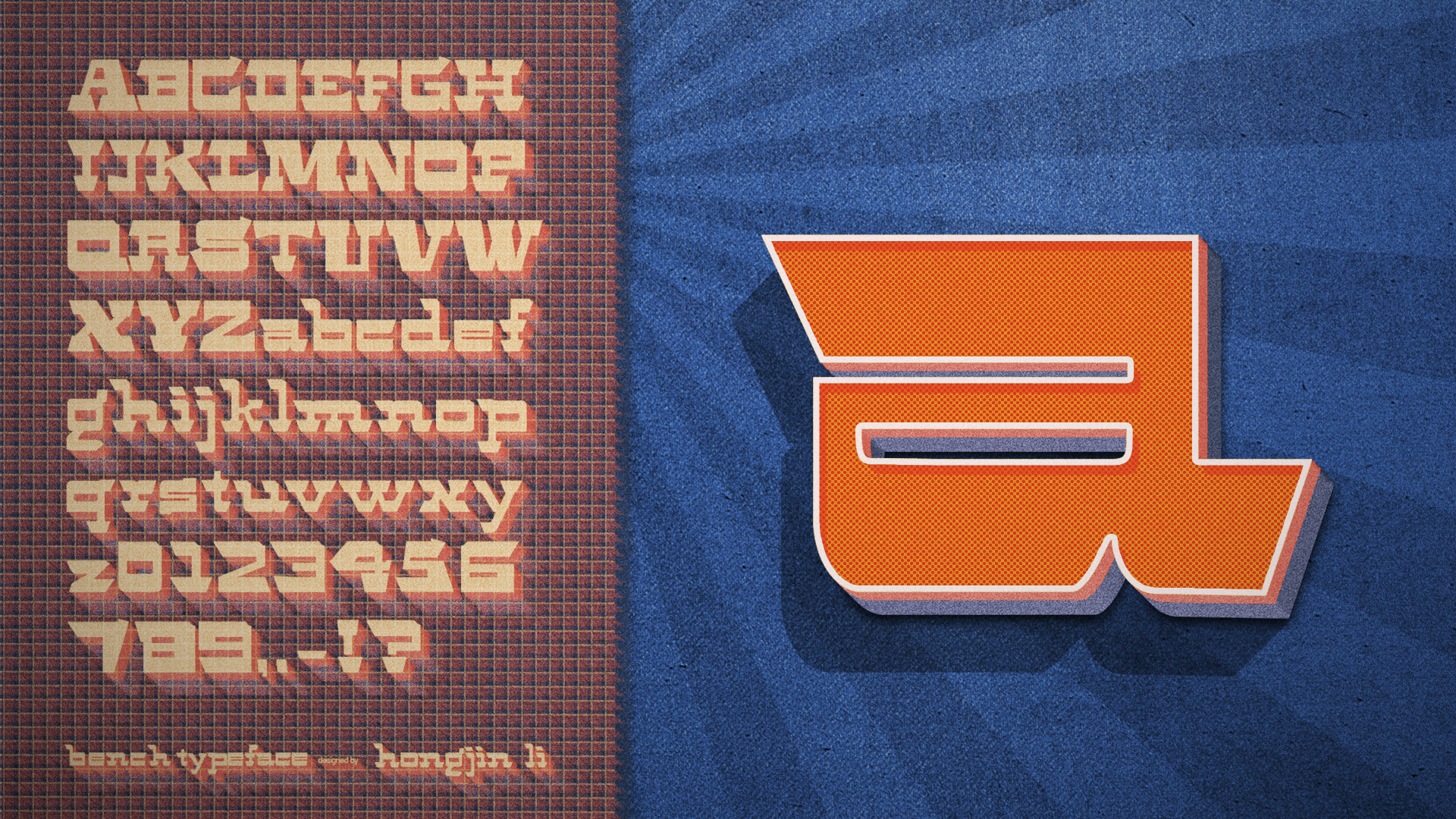
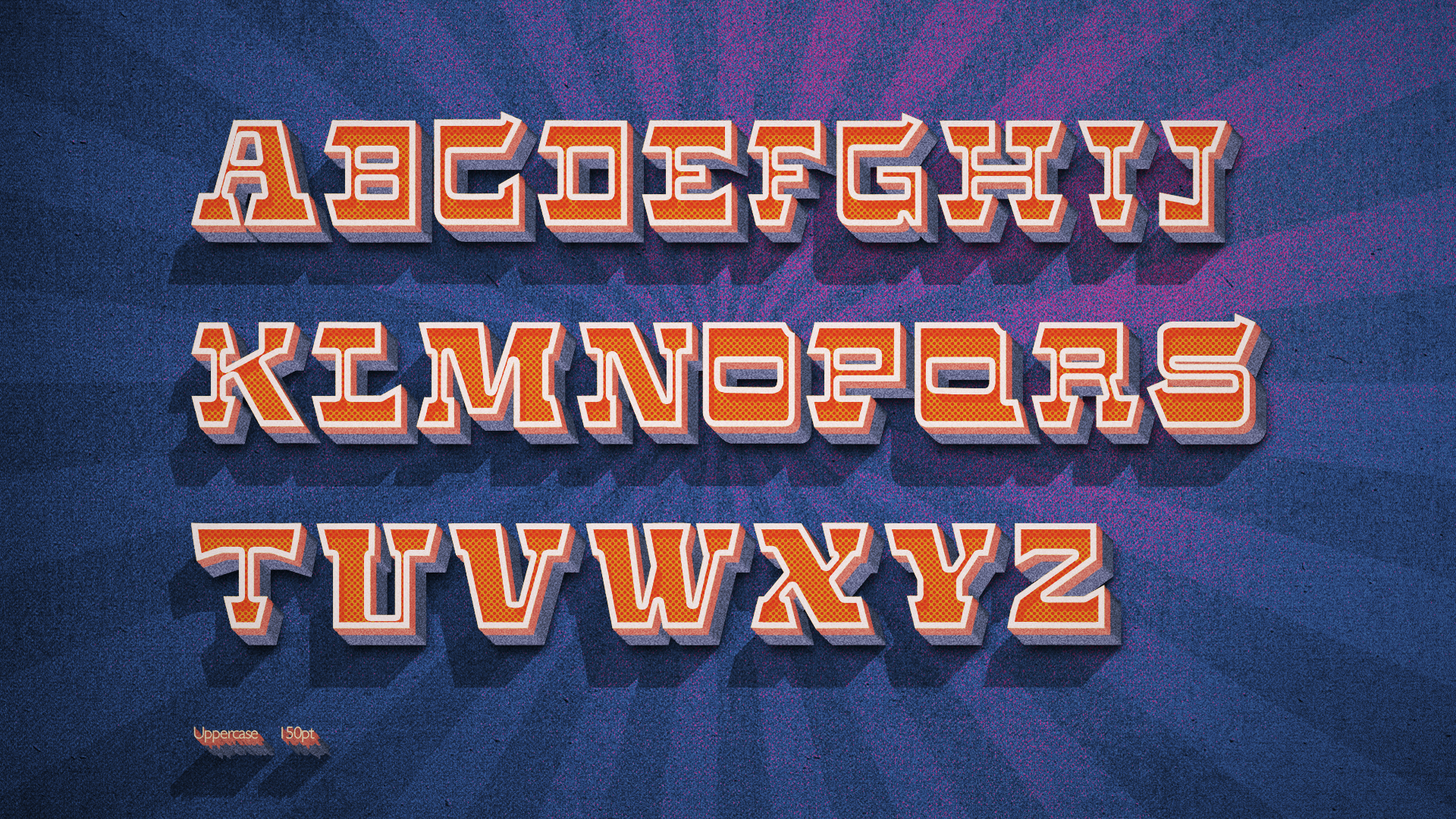
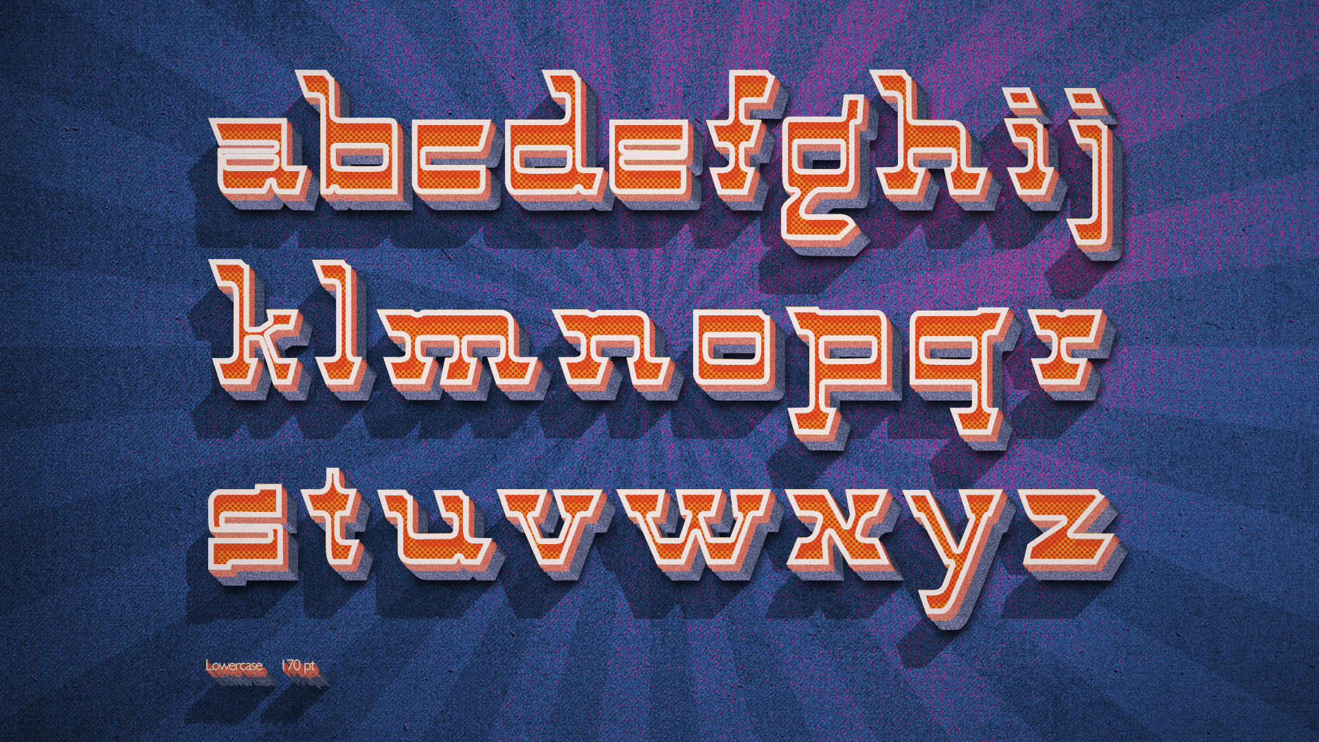
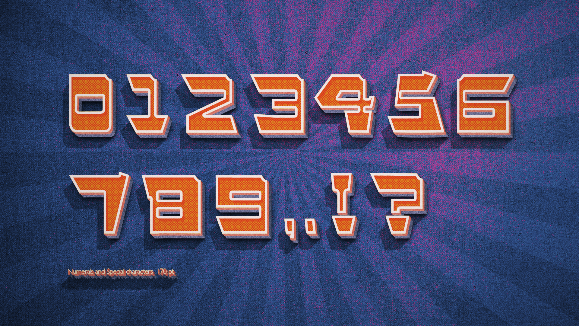
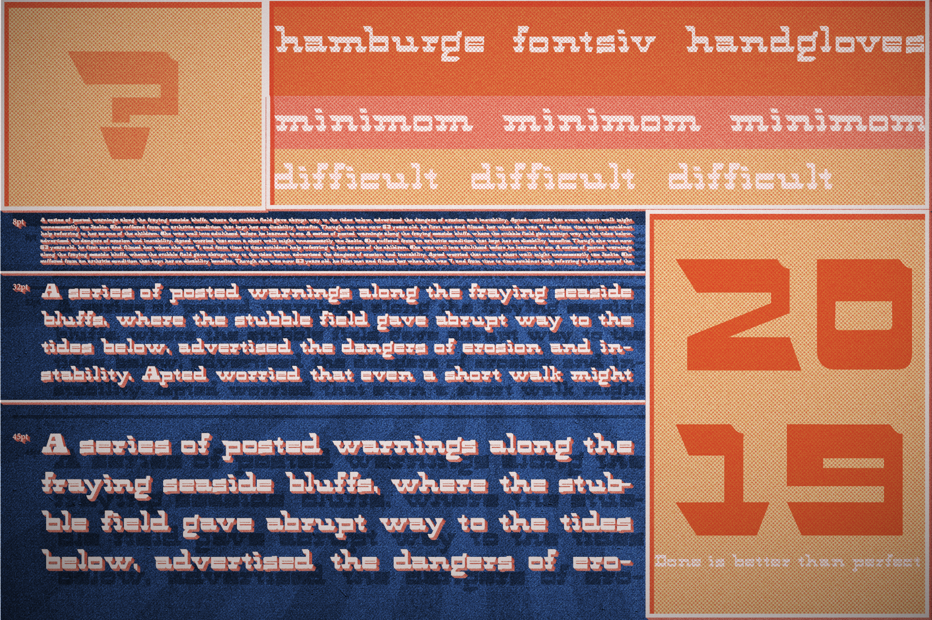
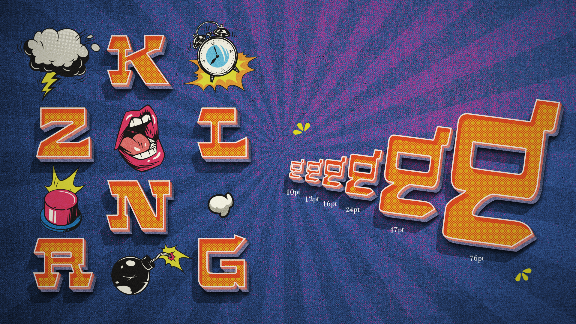
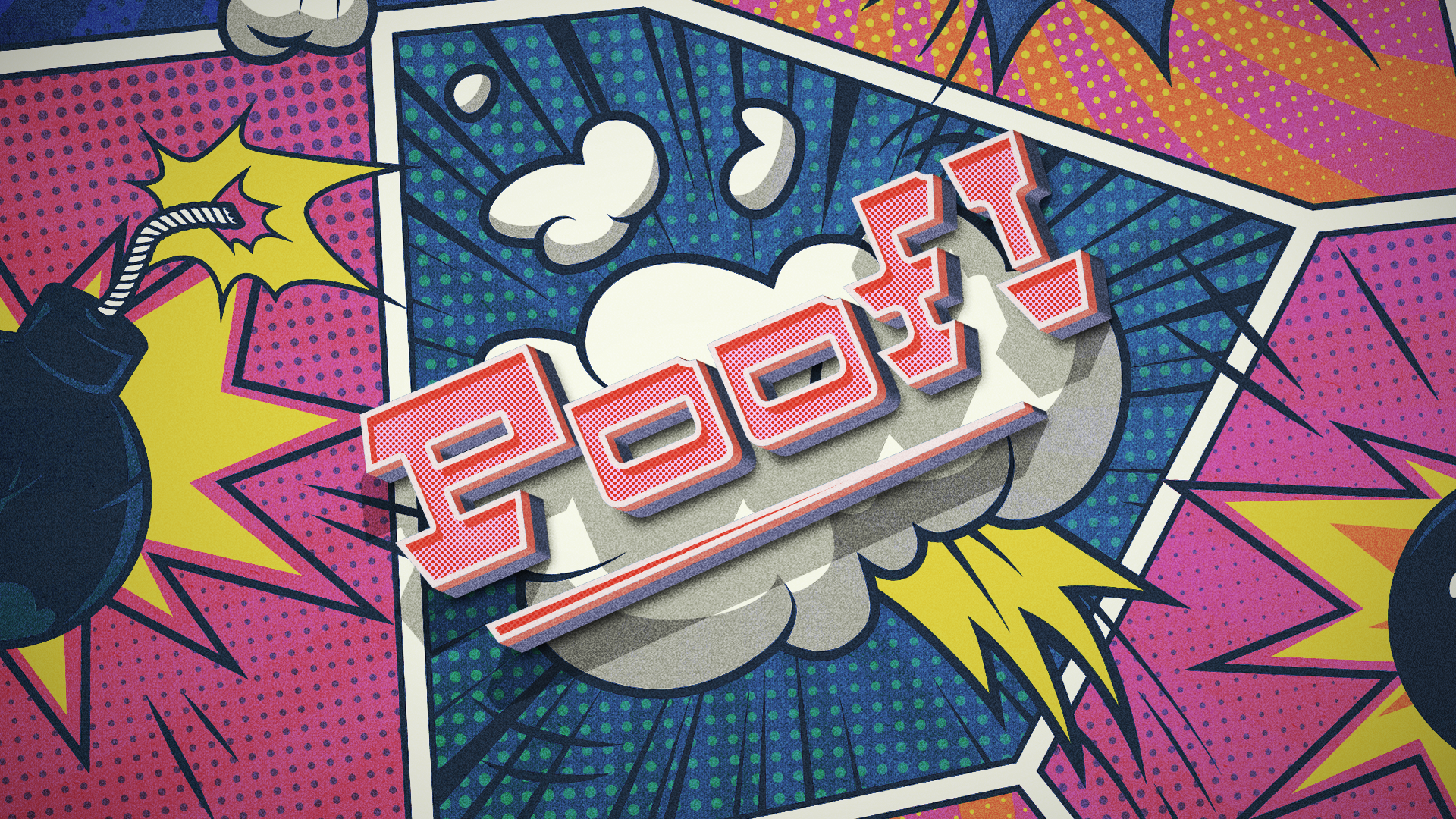
A typeface design called “Bench”, starts from several characteristic hand lettering and geometric letter versions. Expanding the unique characteristics of one letter to a full alphabet sheet, followed Karen Chang’s “Designing type” Book to make sure the preciseness of the letter’s architecture. Finally, coming up with a modular set of letters, numerals, and basic punctuation.
Software: Include the use of "Glyph" to create an actual font that can be used.
/2020
/Instructor: Olga Mezhibovskaya
/Custom Typeface






Experimental Book Design
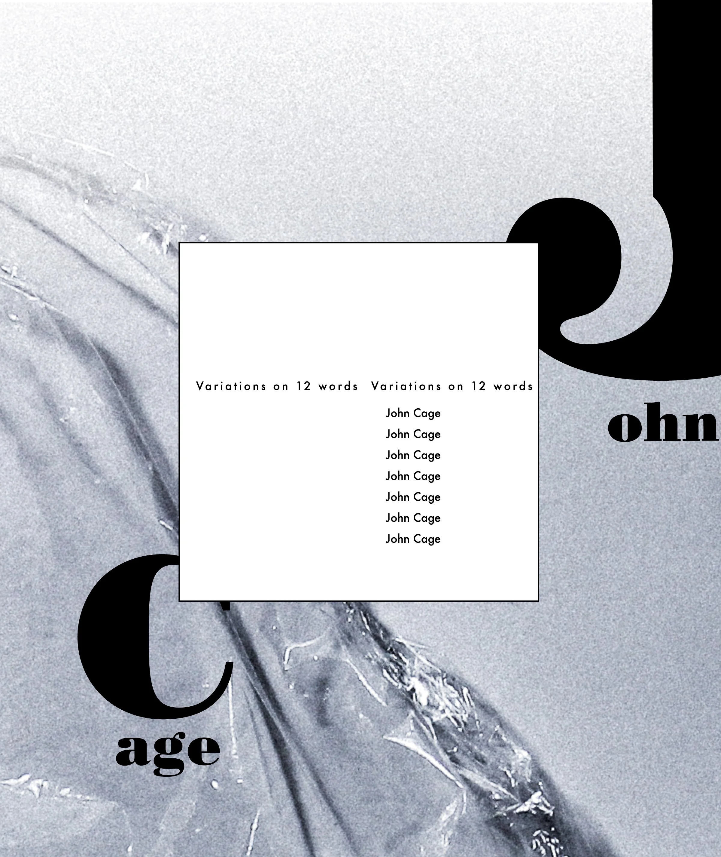
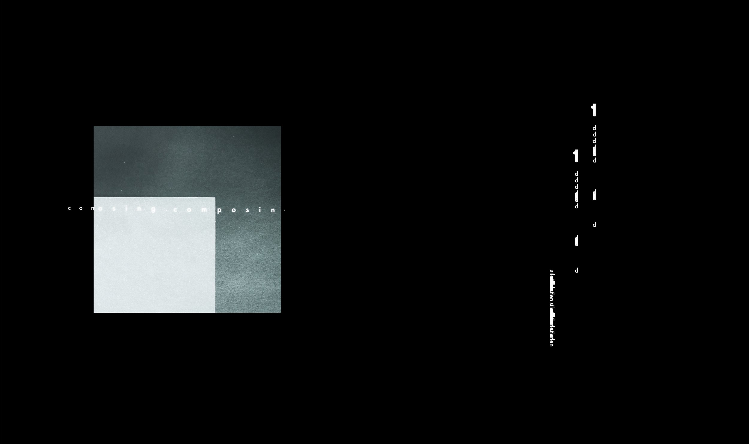
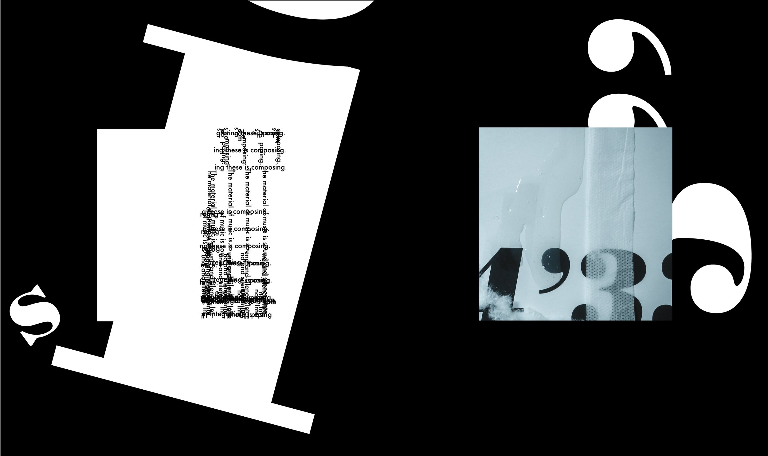
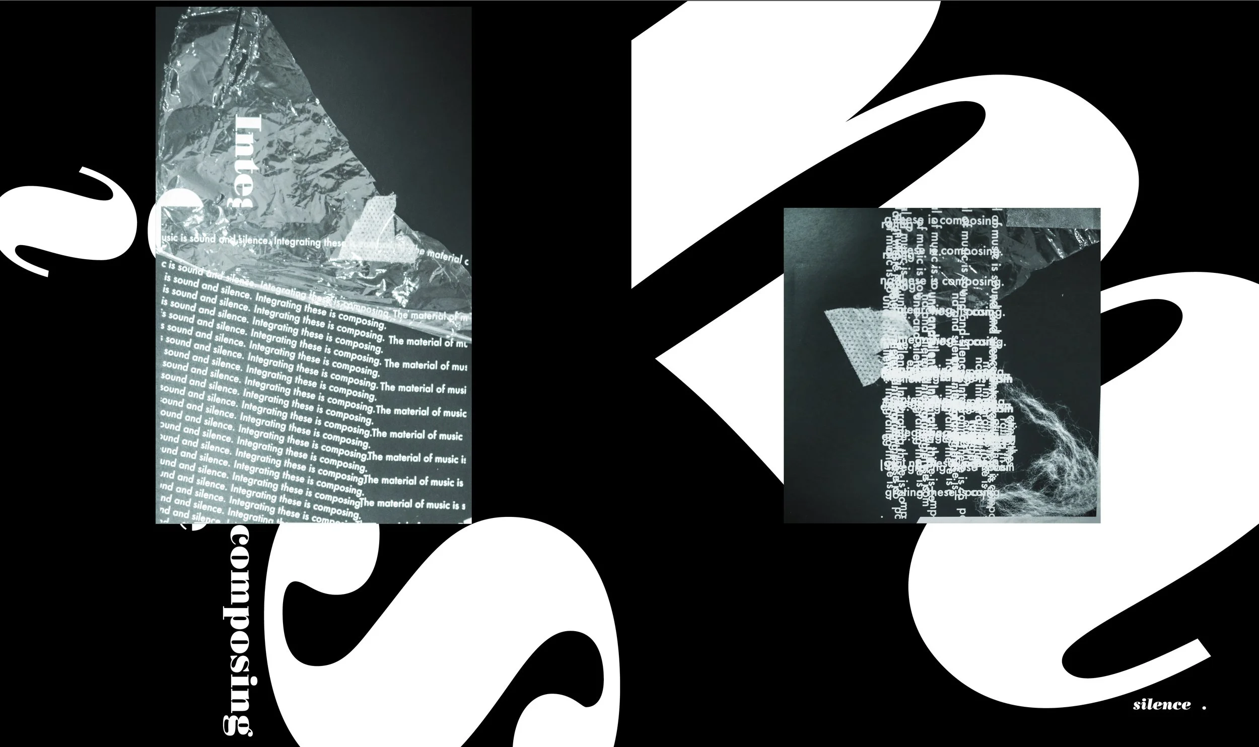
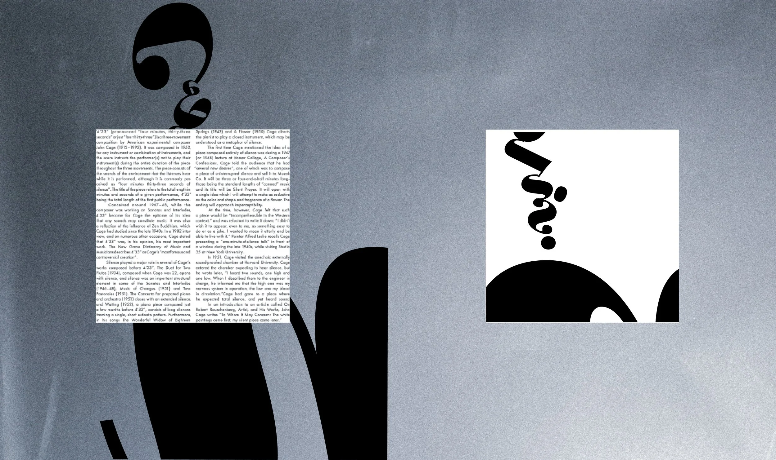
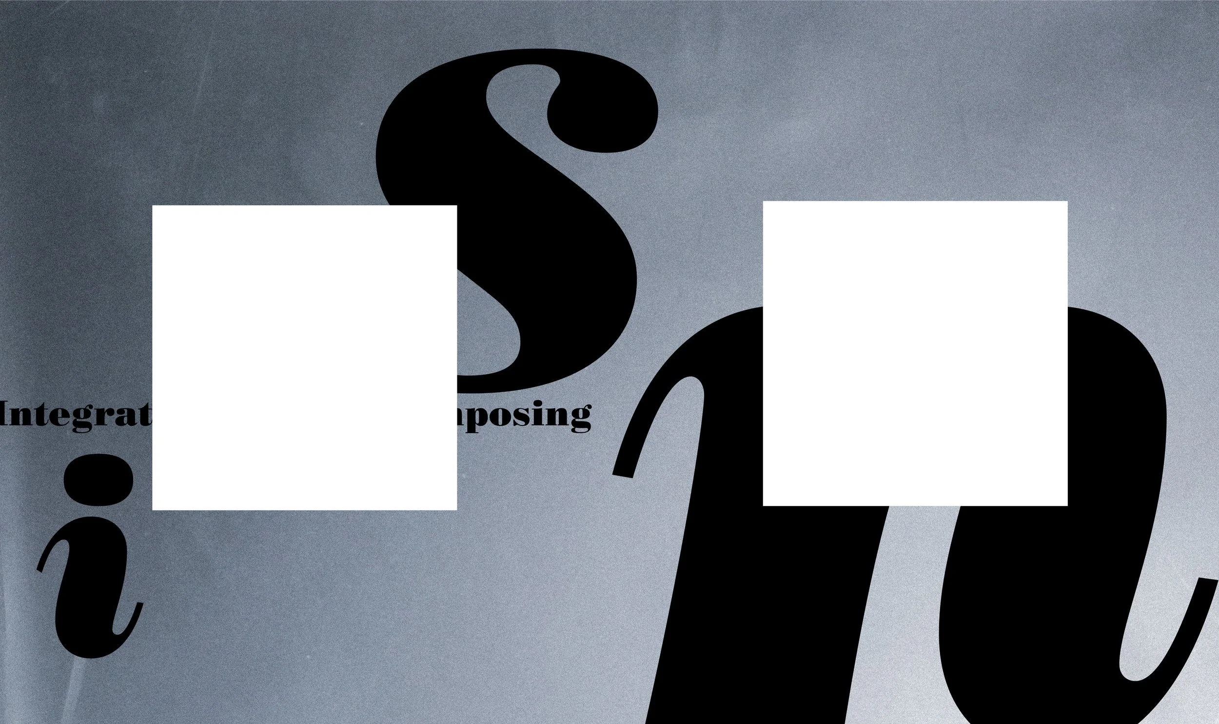
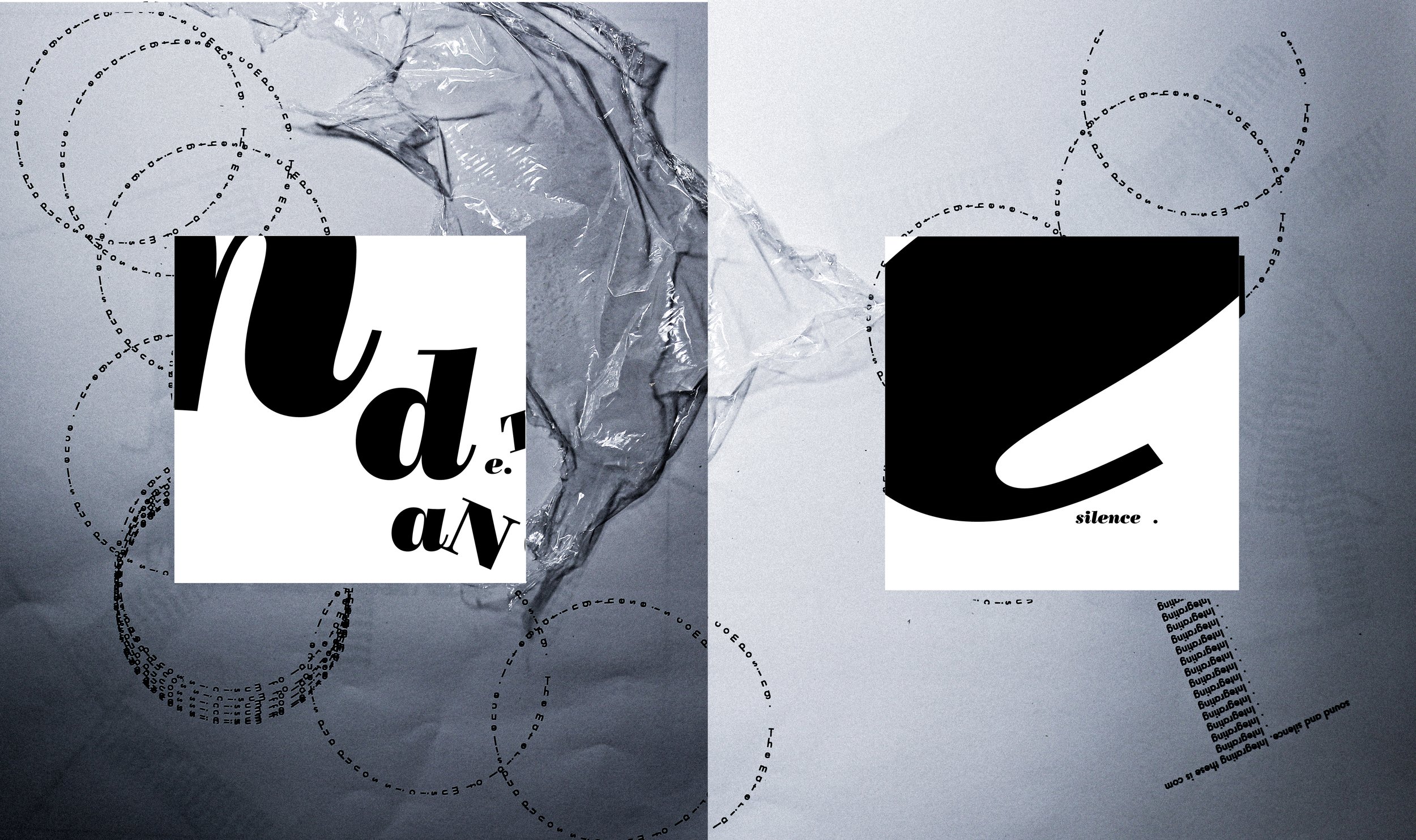
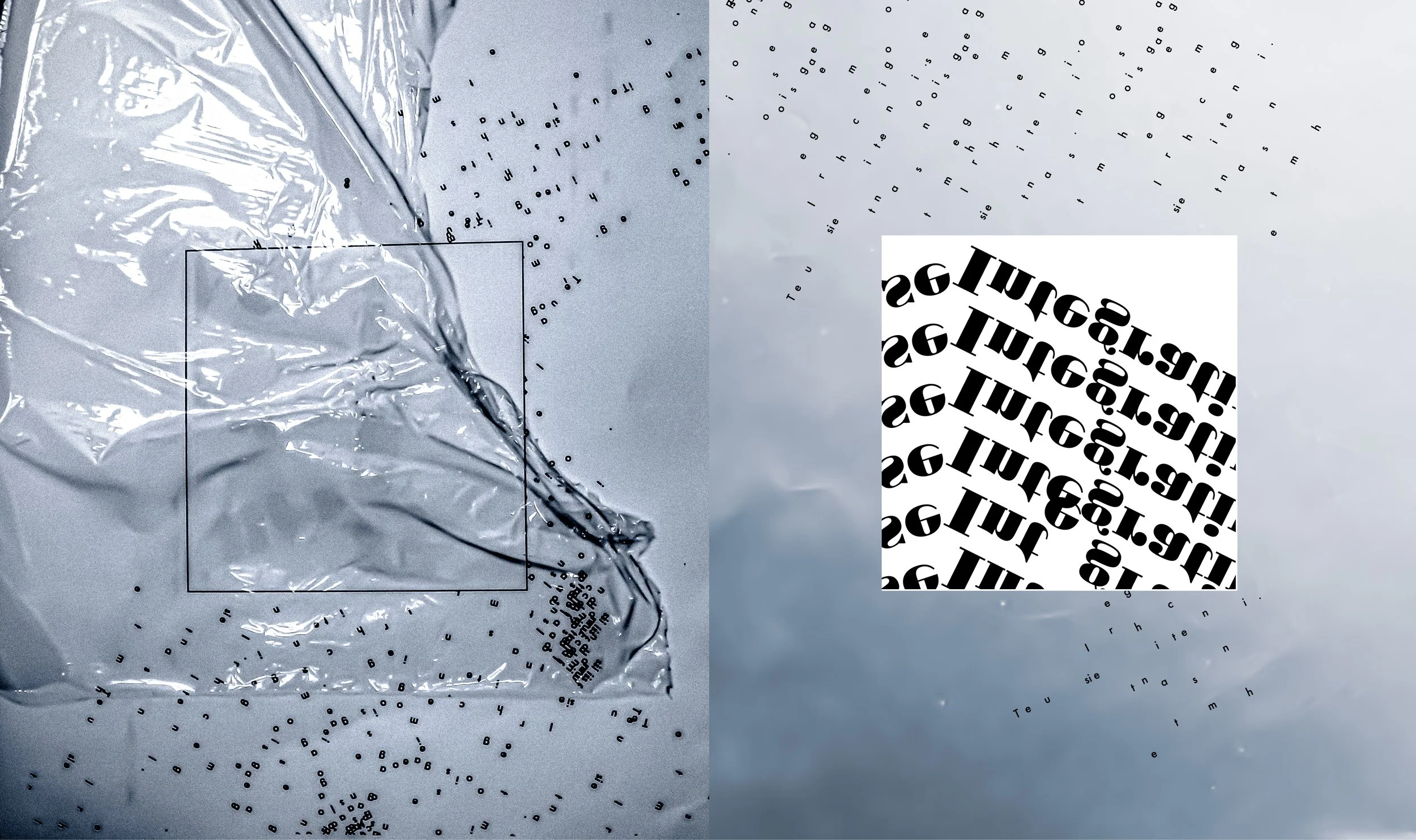
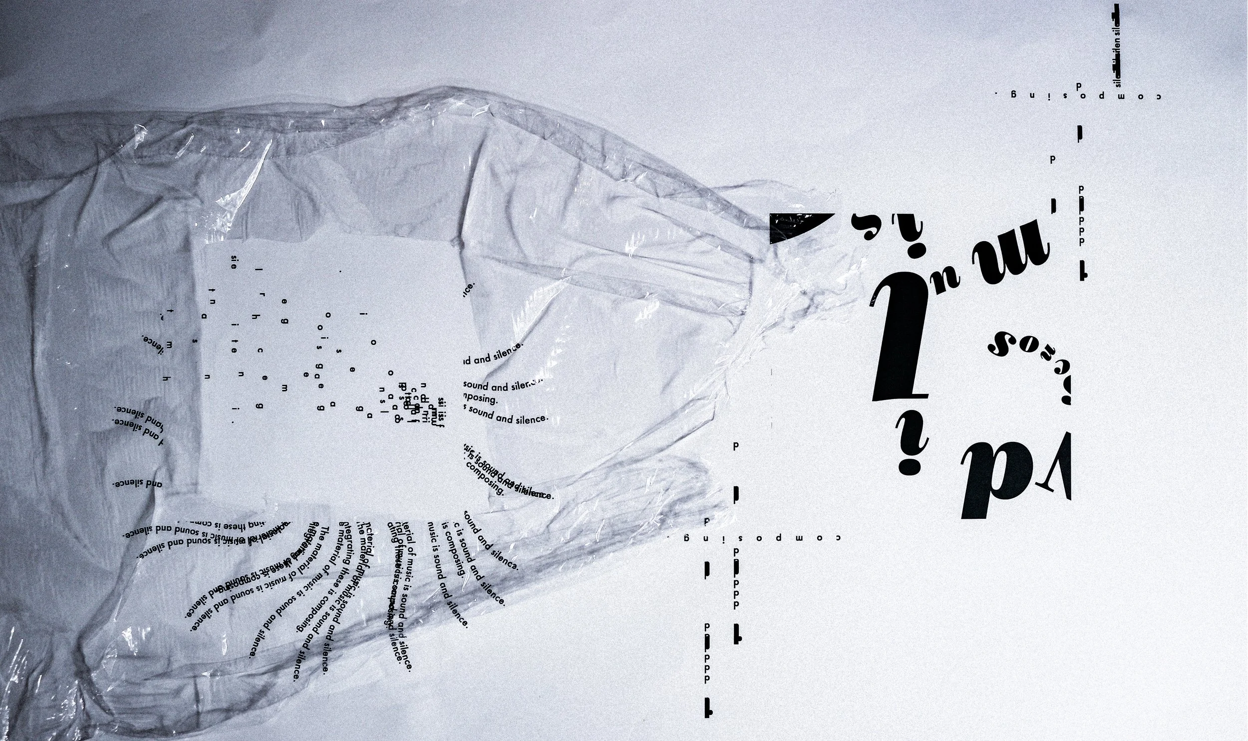
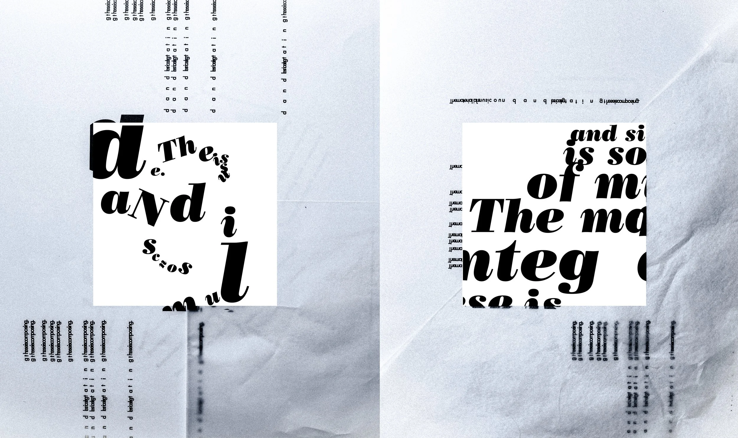
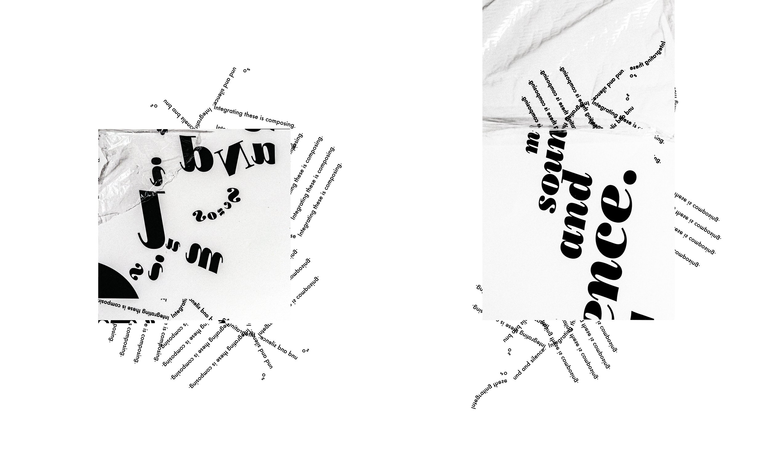
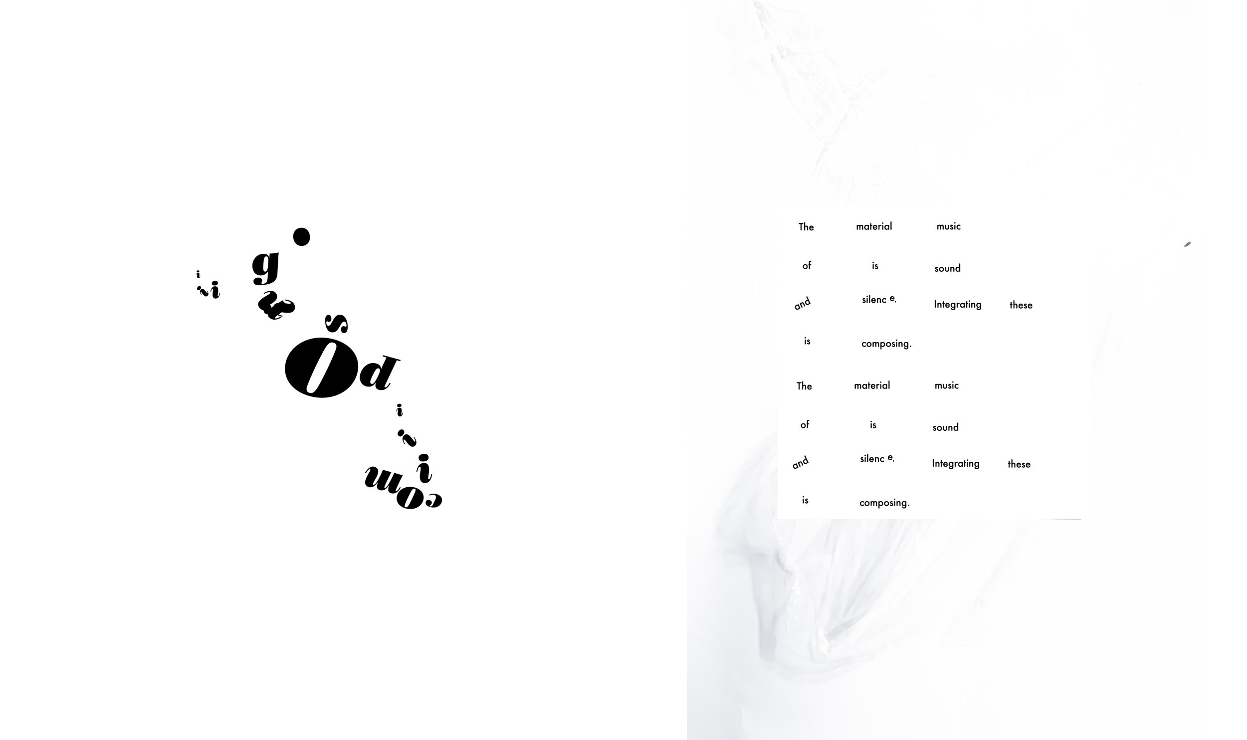
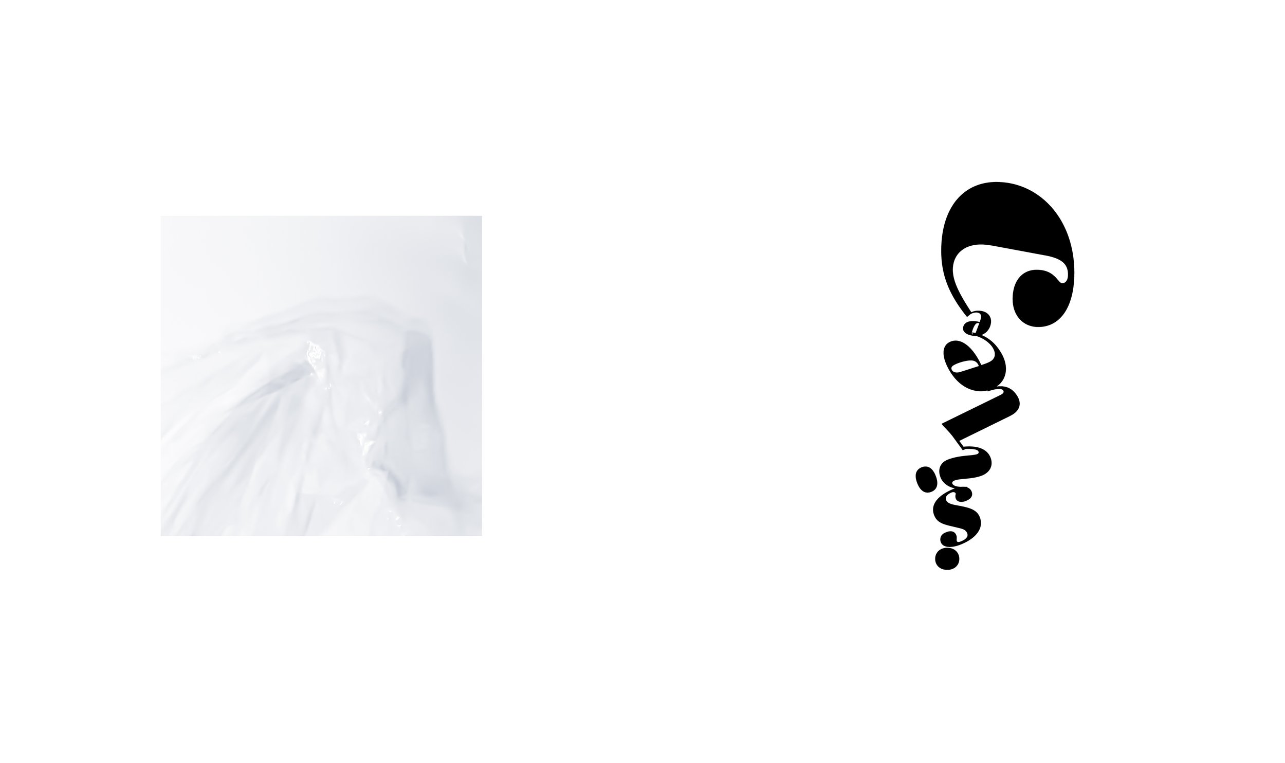
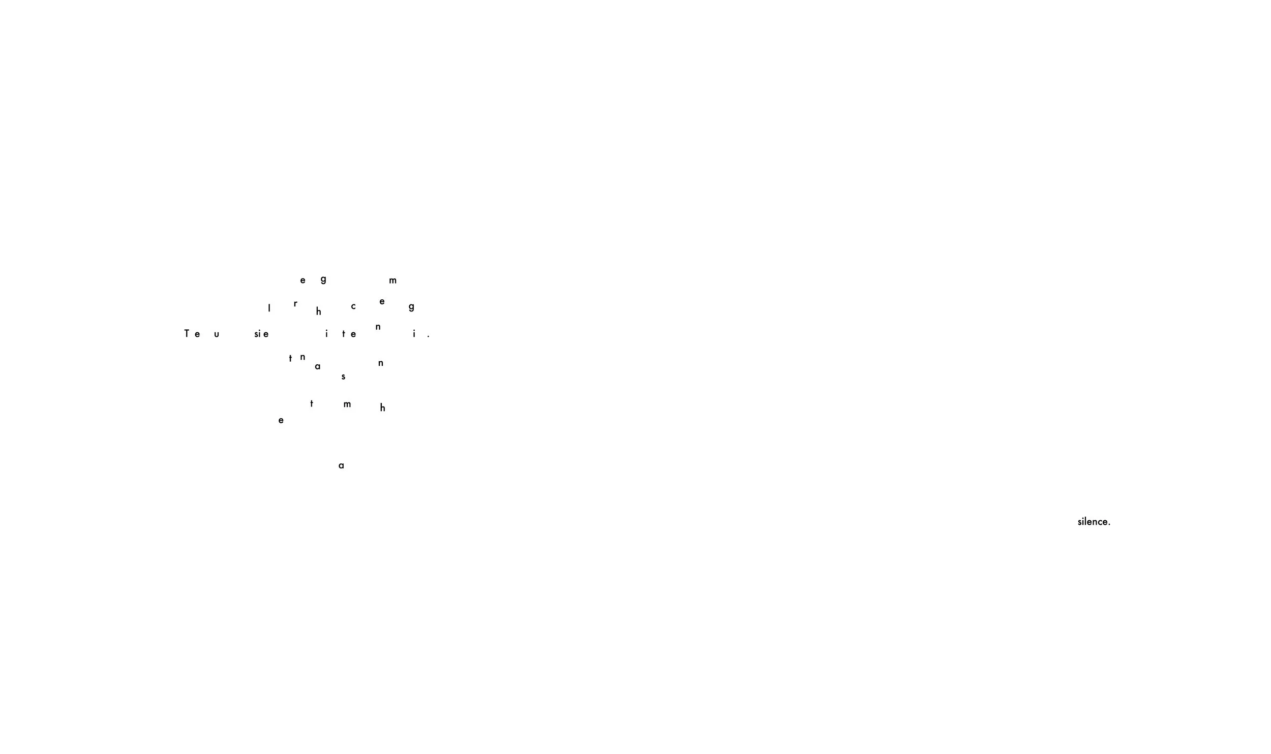
“4'33",’’ a conceptual work by John Cage. It has been called the “silent piece,” but its purpose is to make people listen. “There’s no such thing as silence,” Cage said, recalling the première.
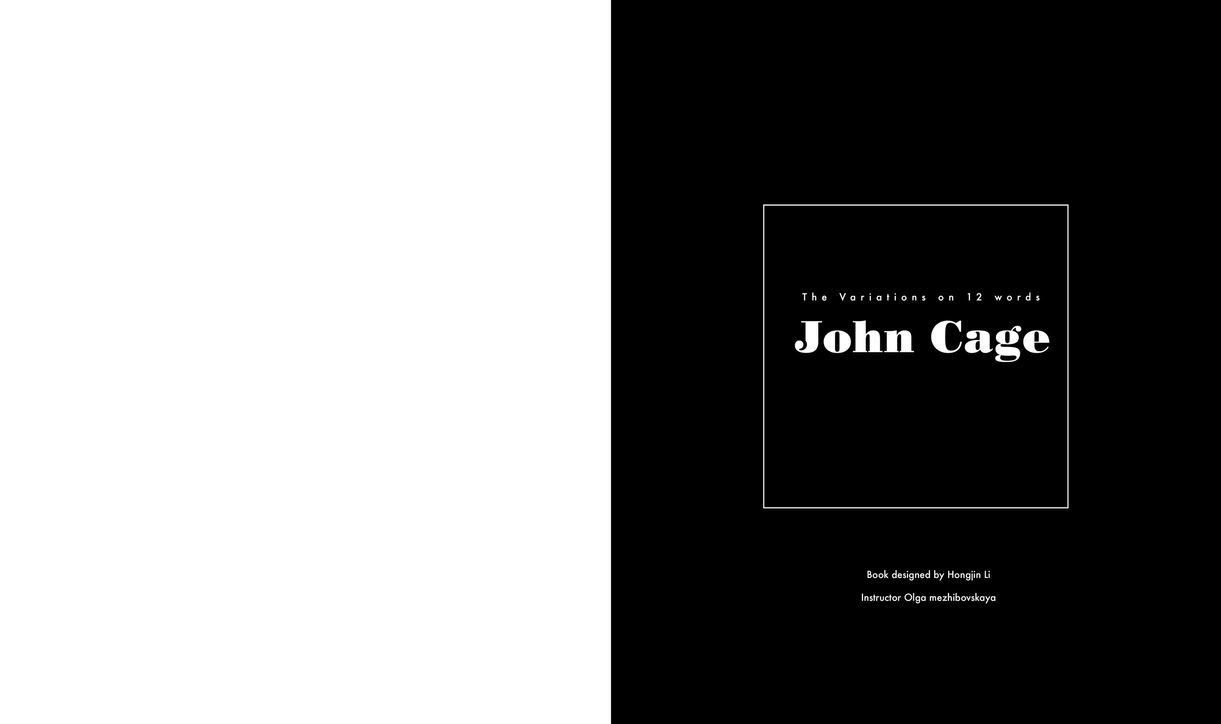
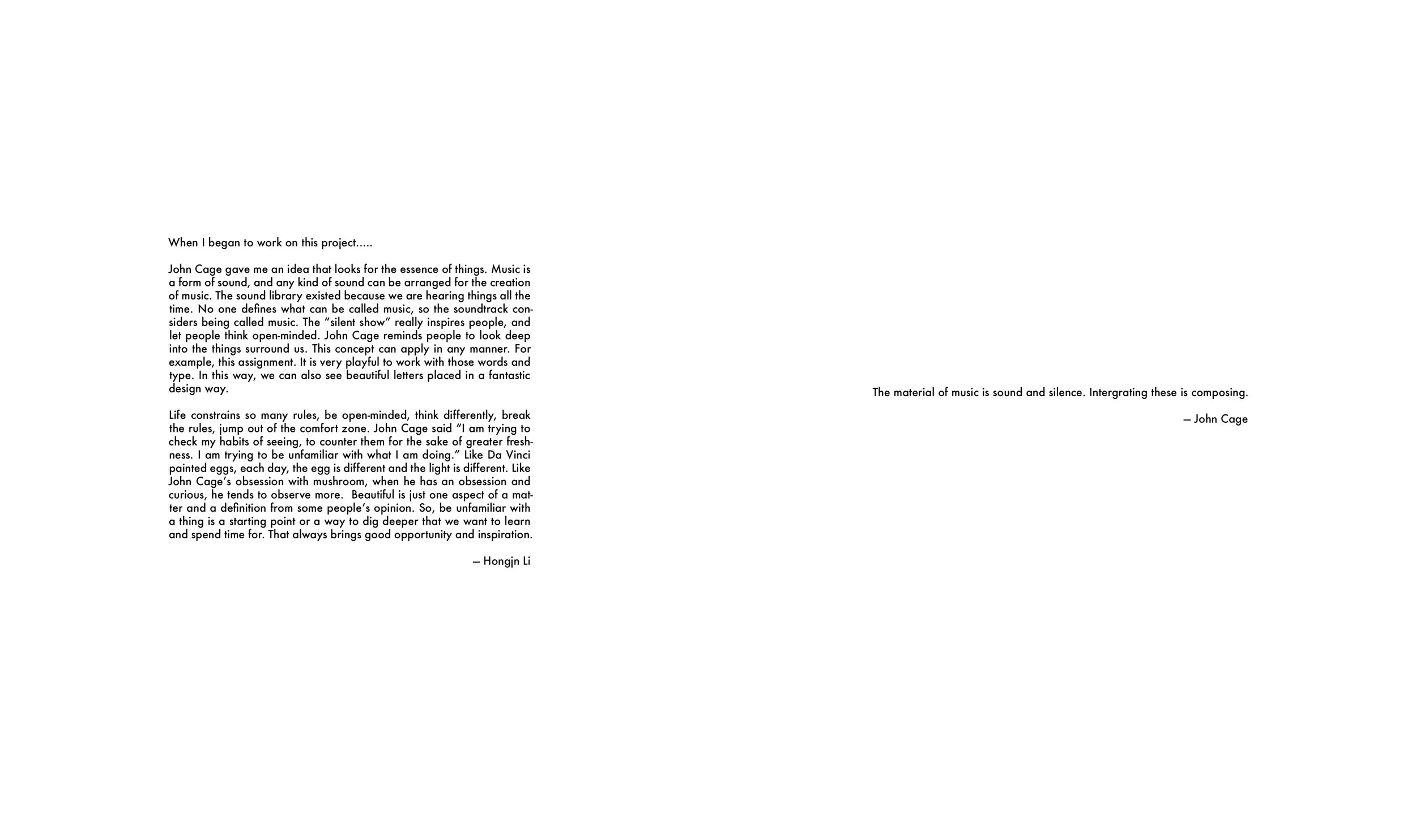
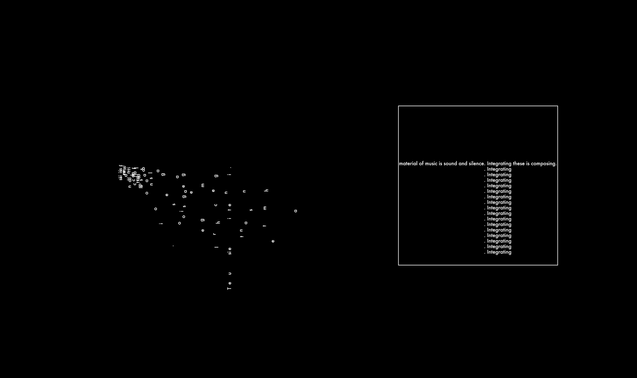
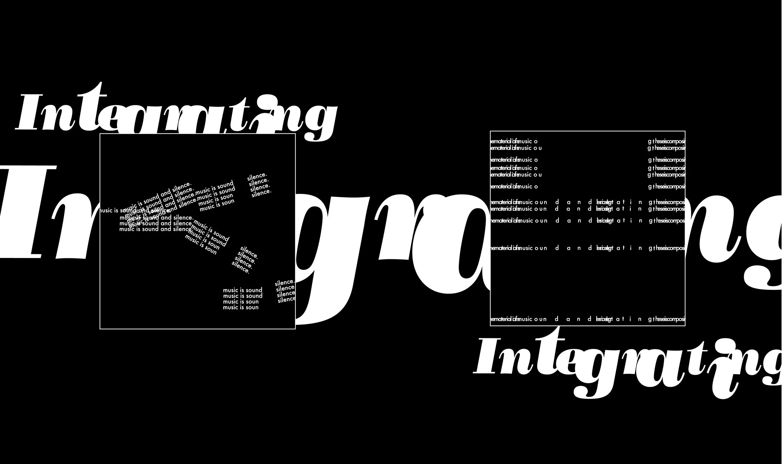
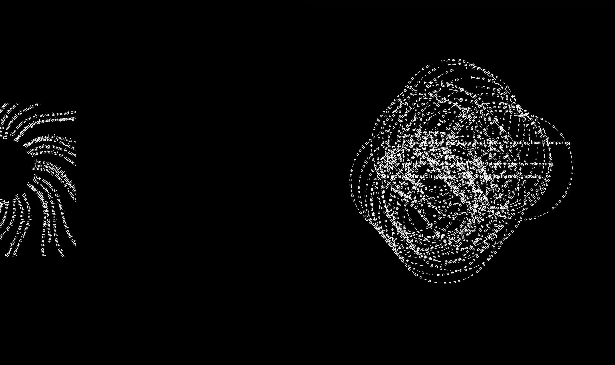
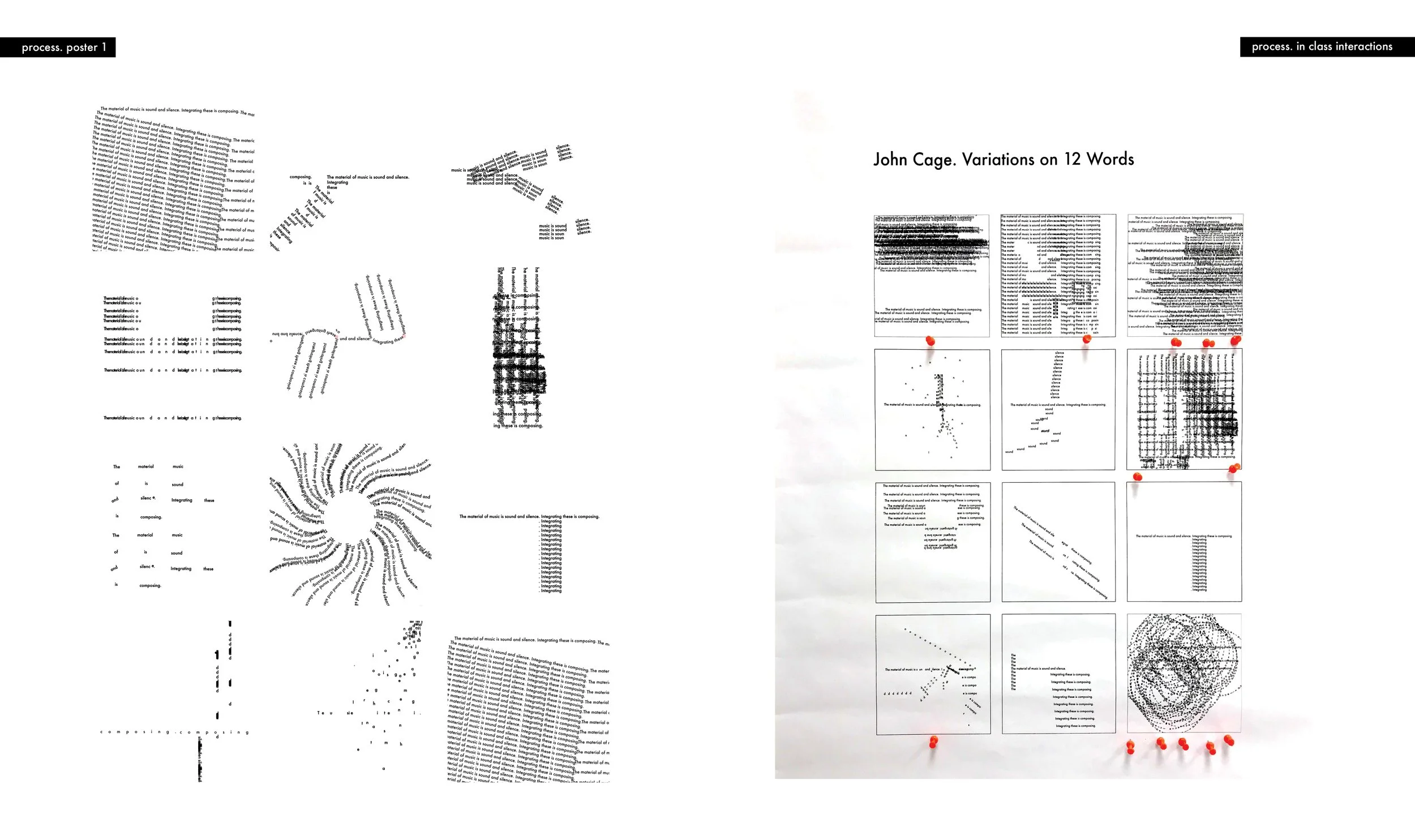
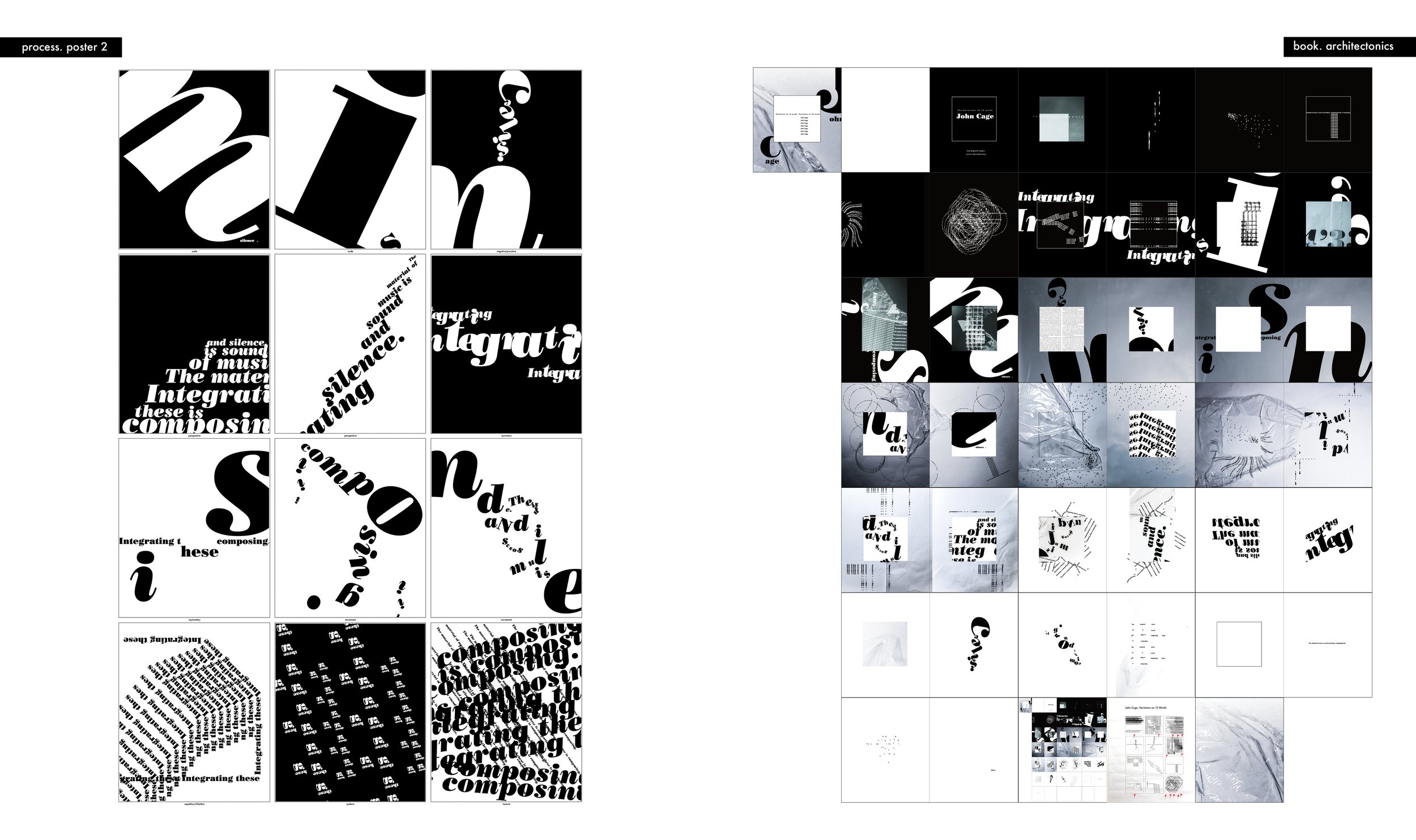
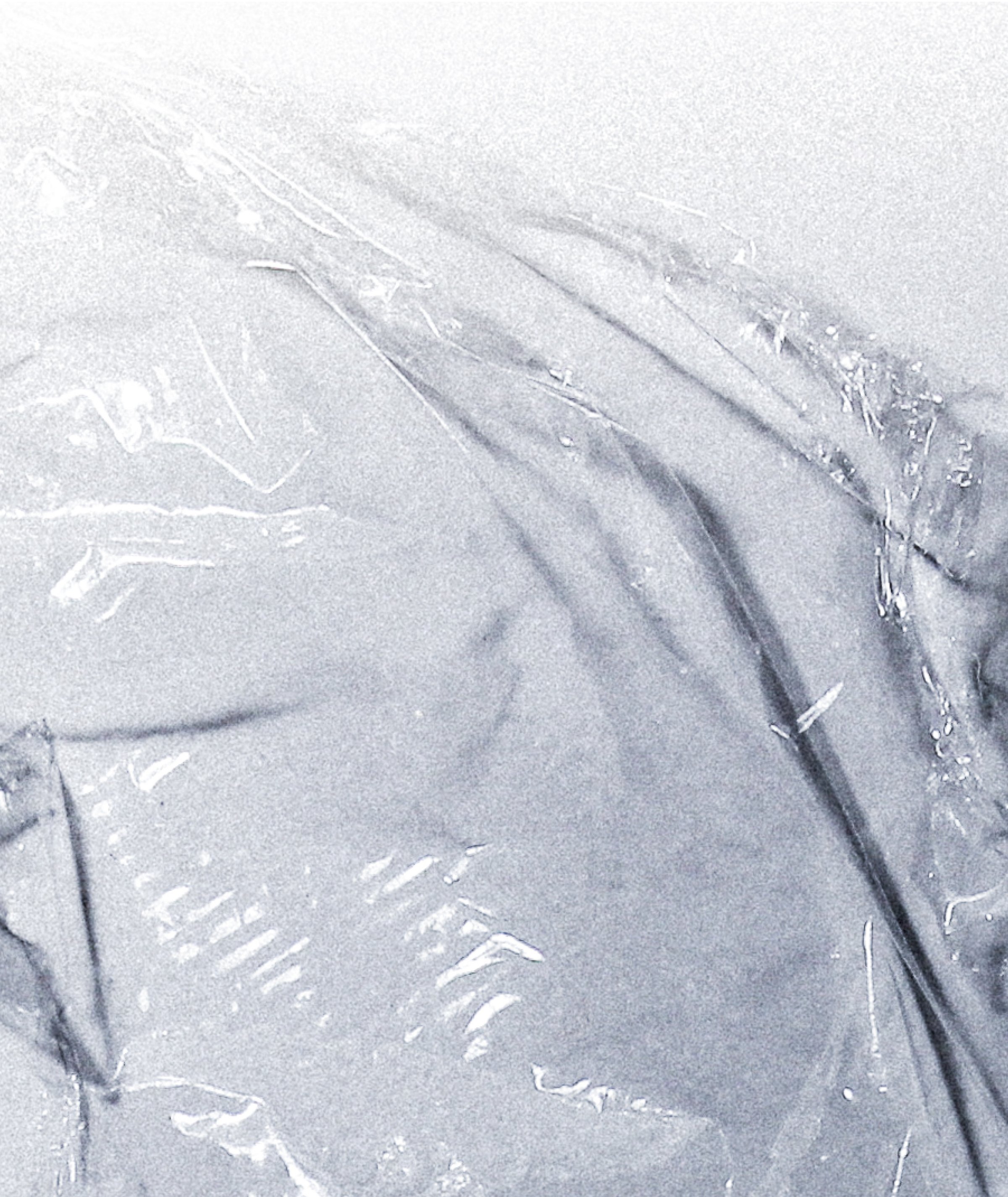
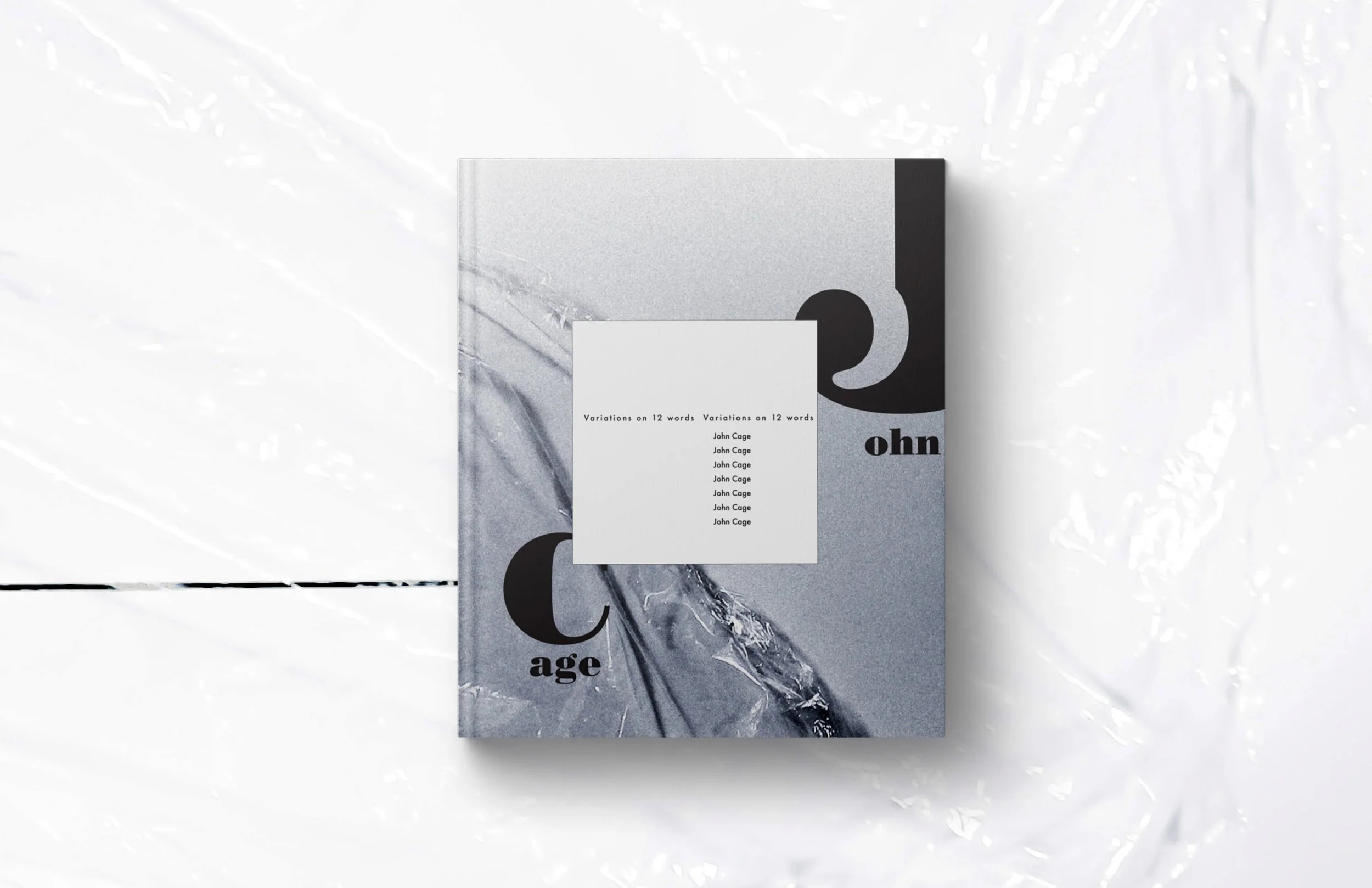
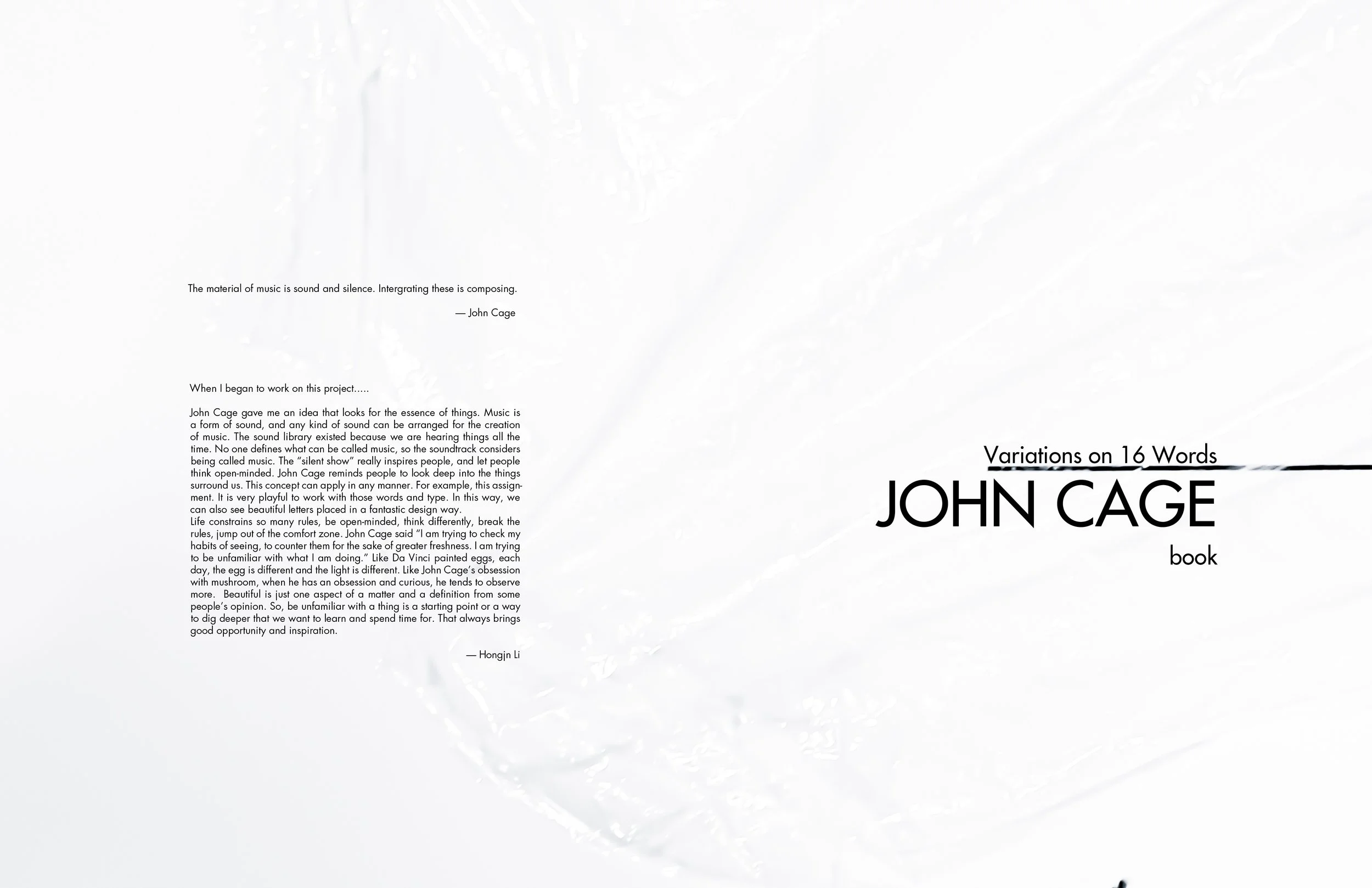
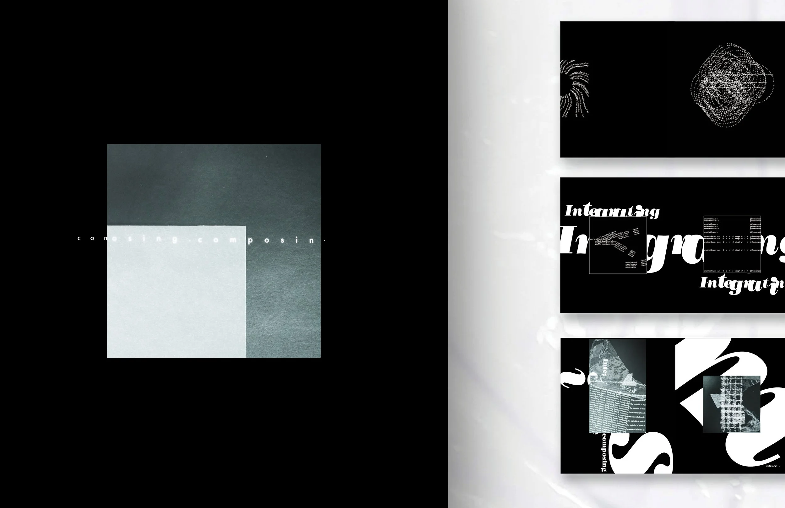
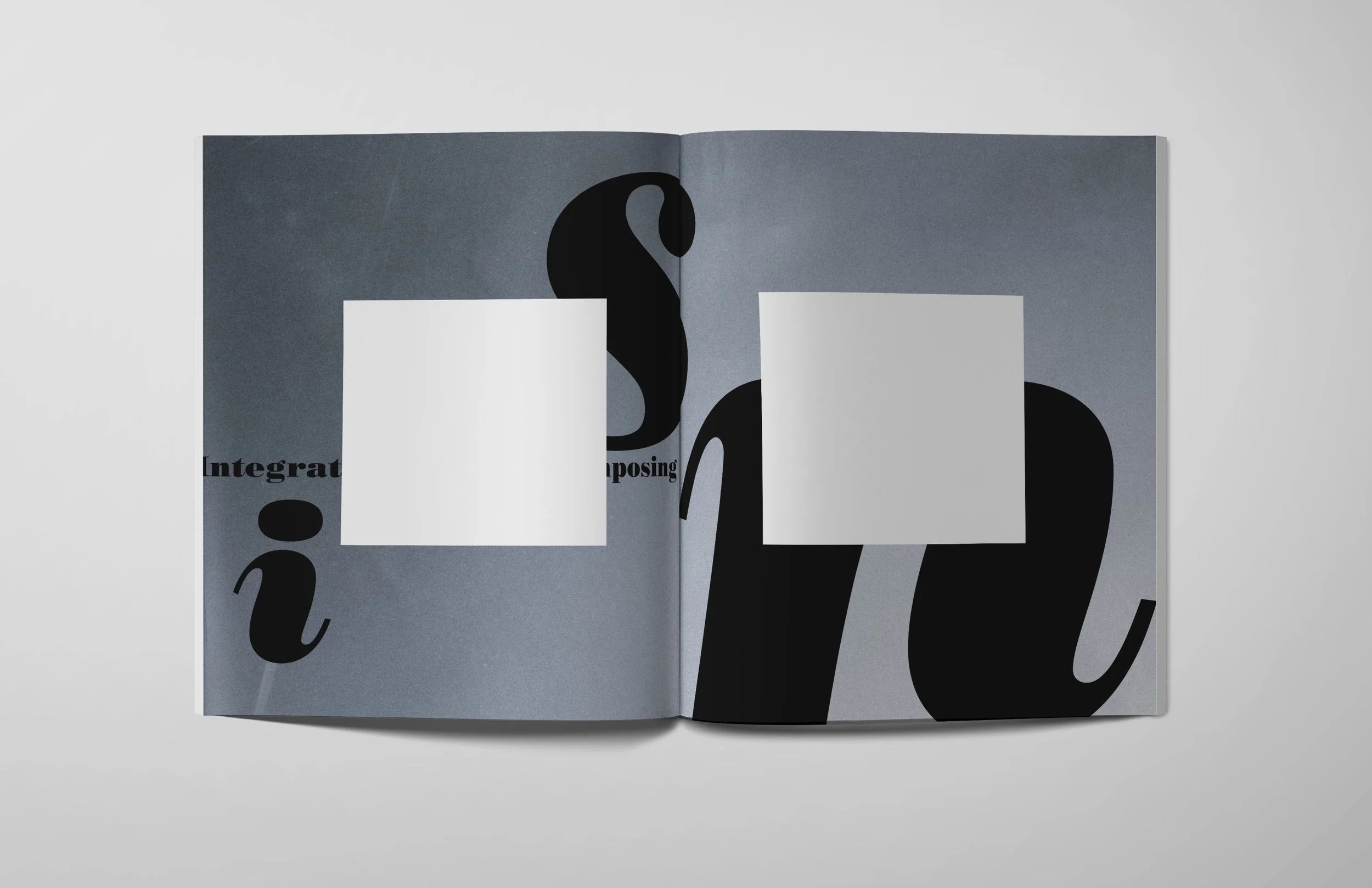
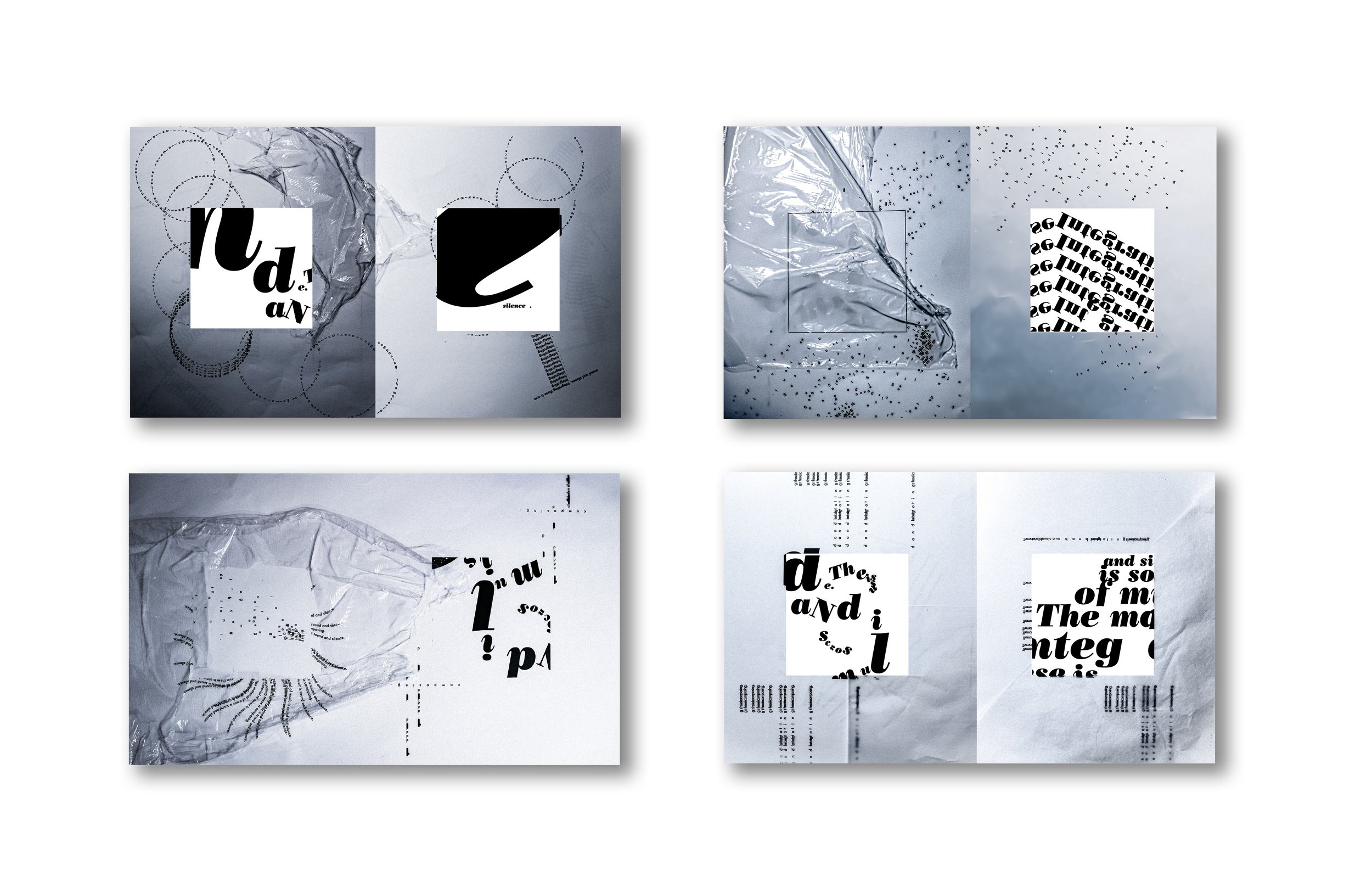
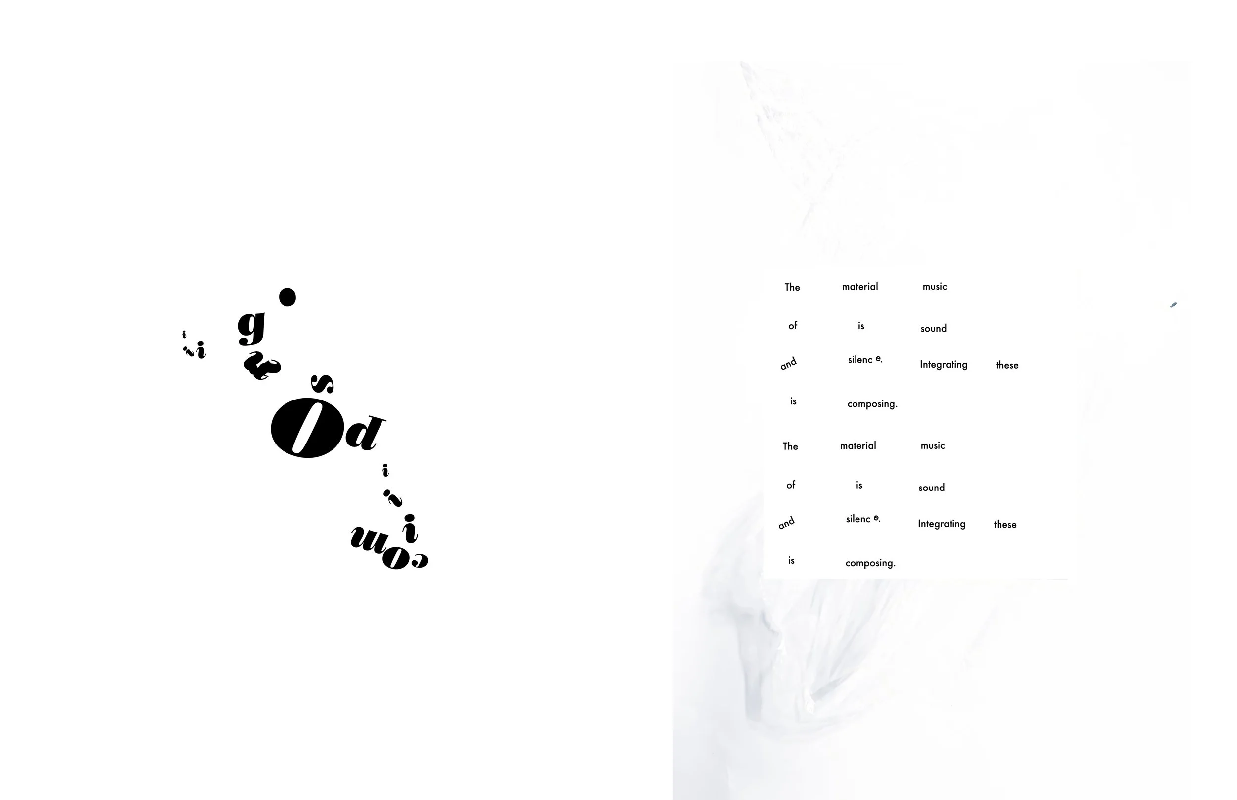
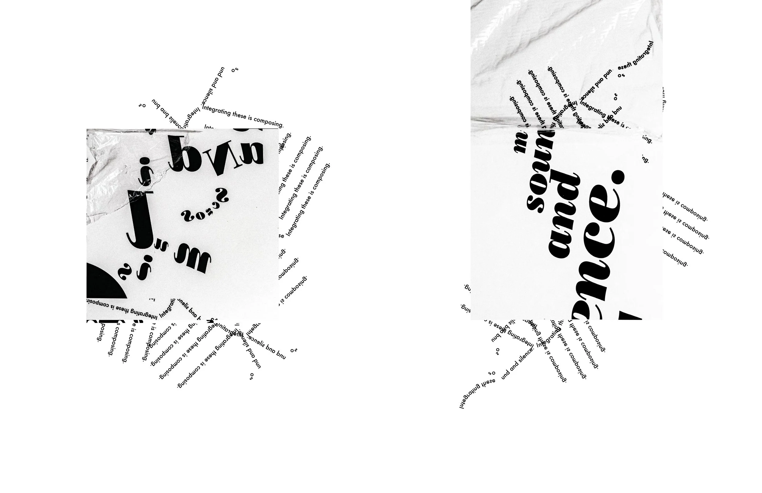
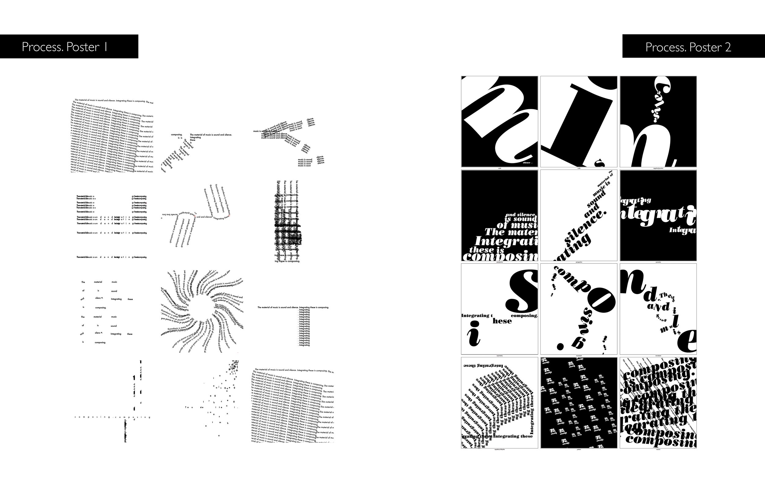
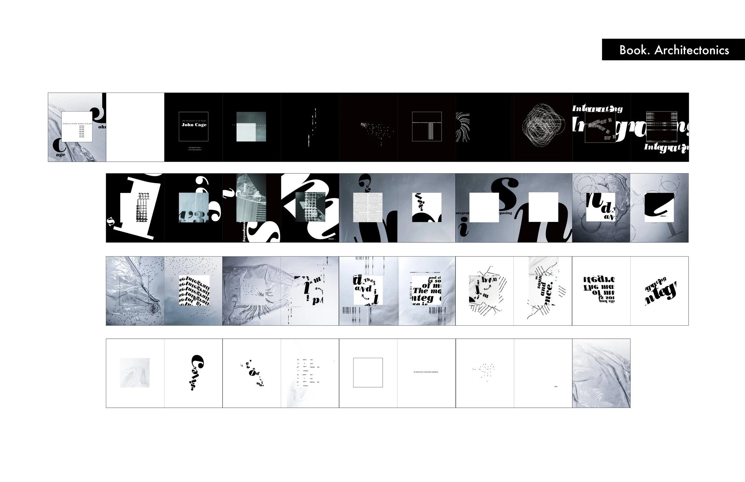
This experimental design book was inspired by John Cage's methodology of understanding music. Designing from a music perspective and architectonics. Combing with interesting Letter compositions using the principles of design and interacting with found objects, such as plastics. At the final Stage, photography comes in and plays an important role in creating pages background.
/2020
/Instructor: Olga Mezhibovskaya
/Editorial Design



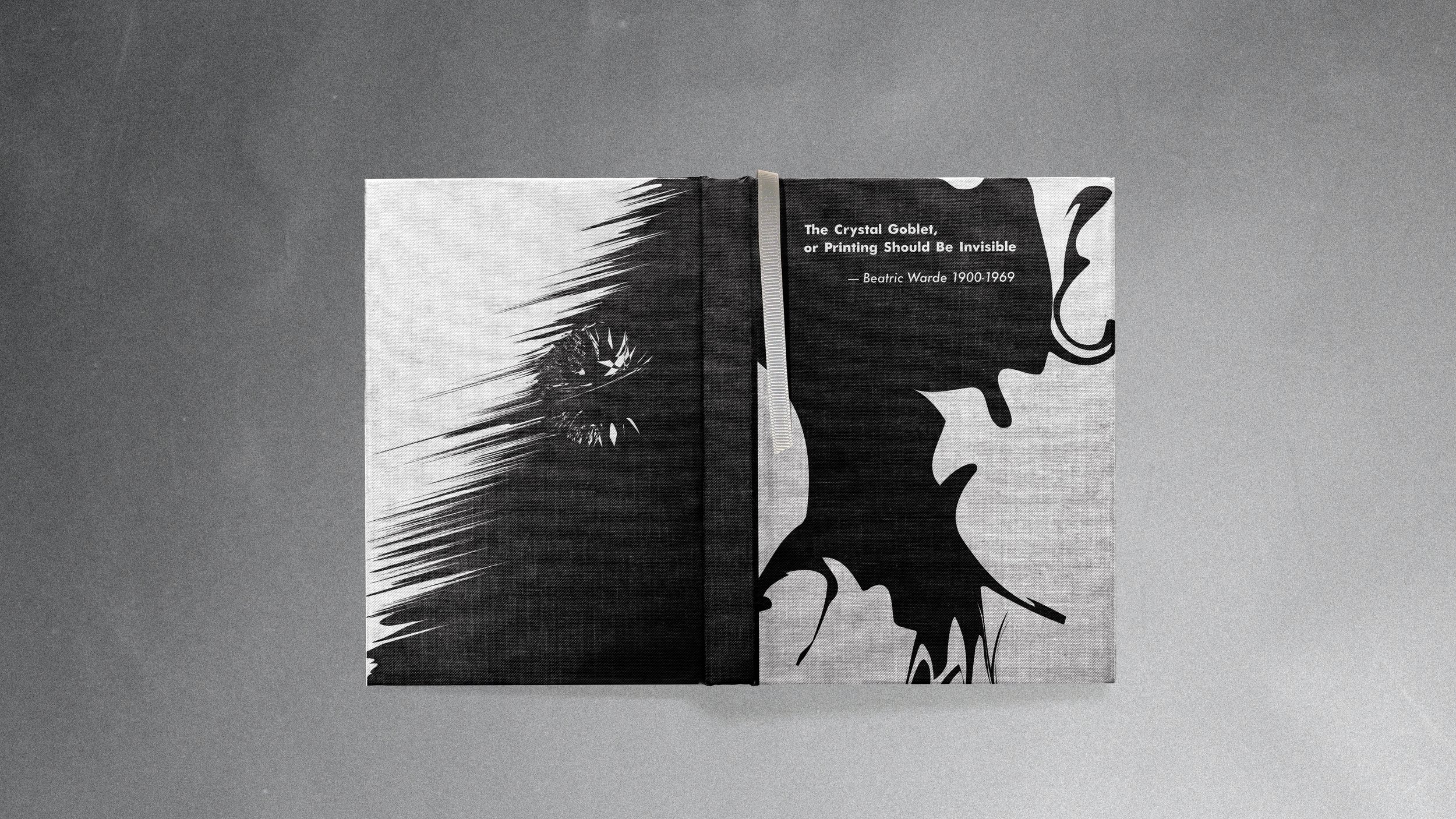
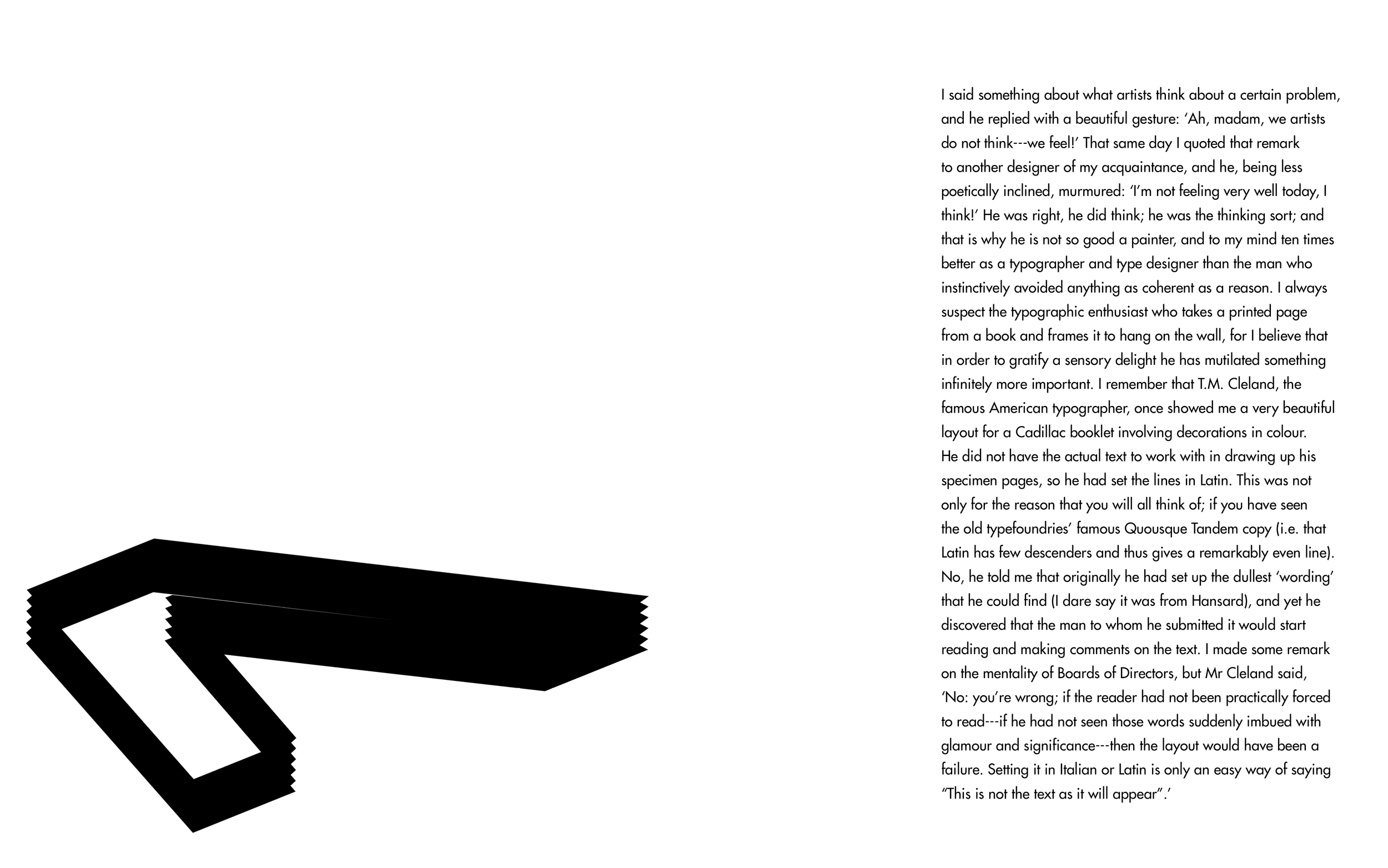
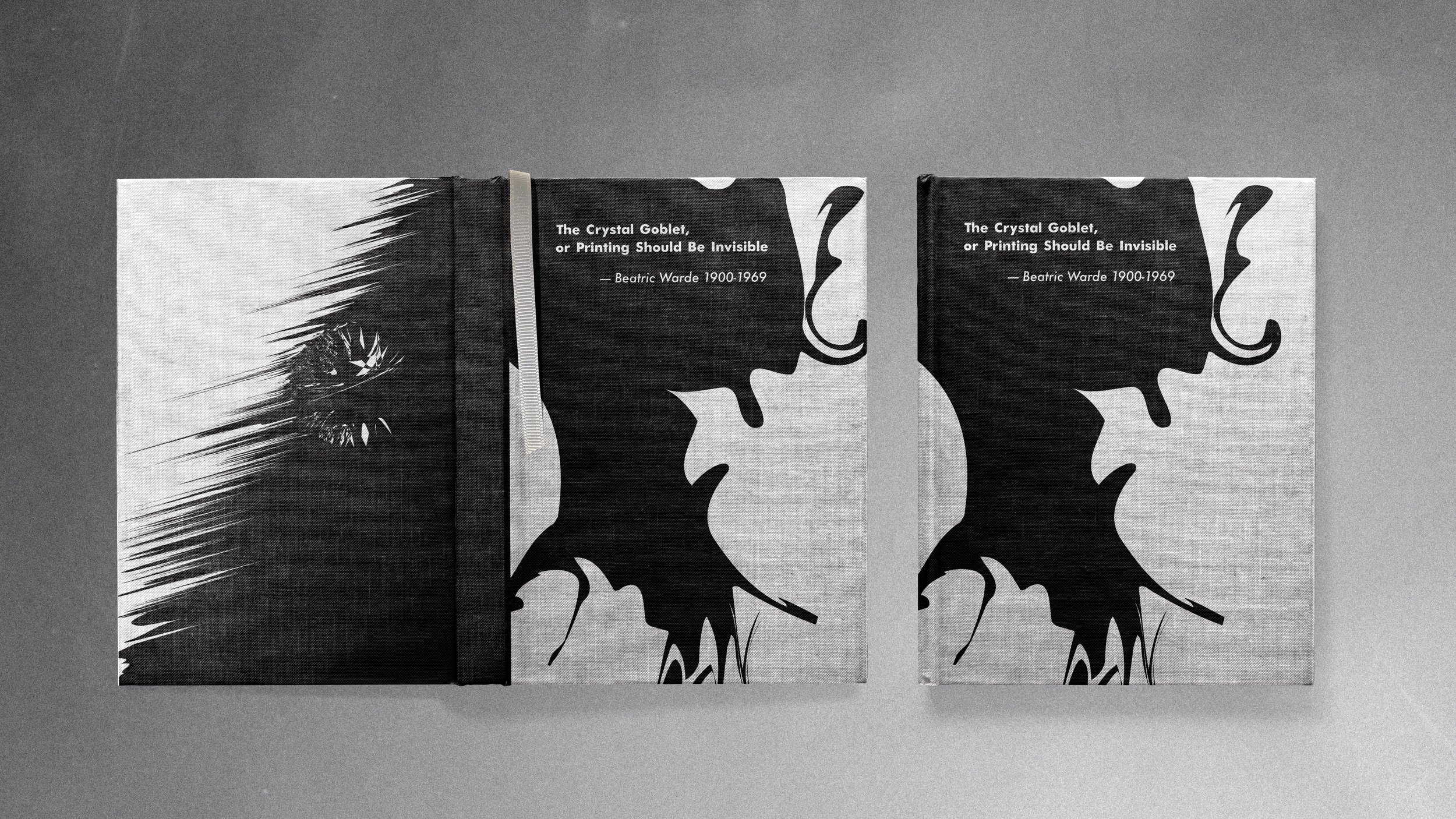
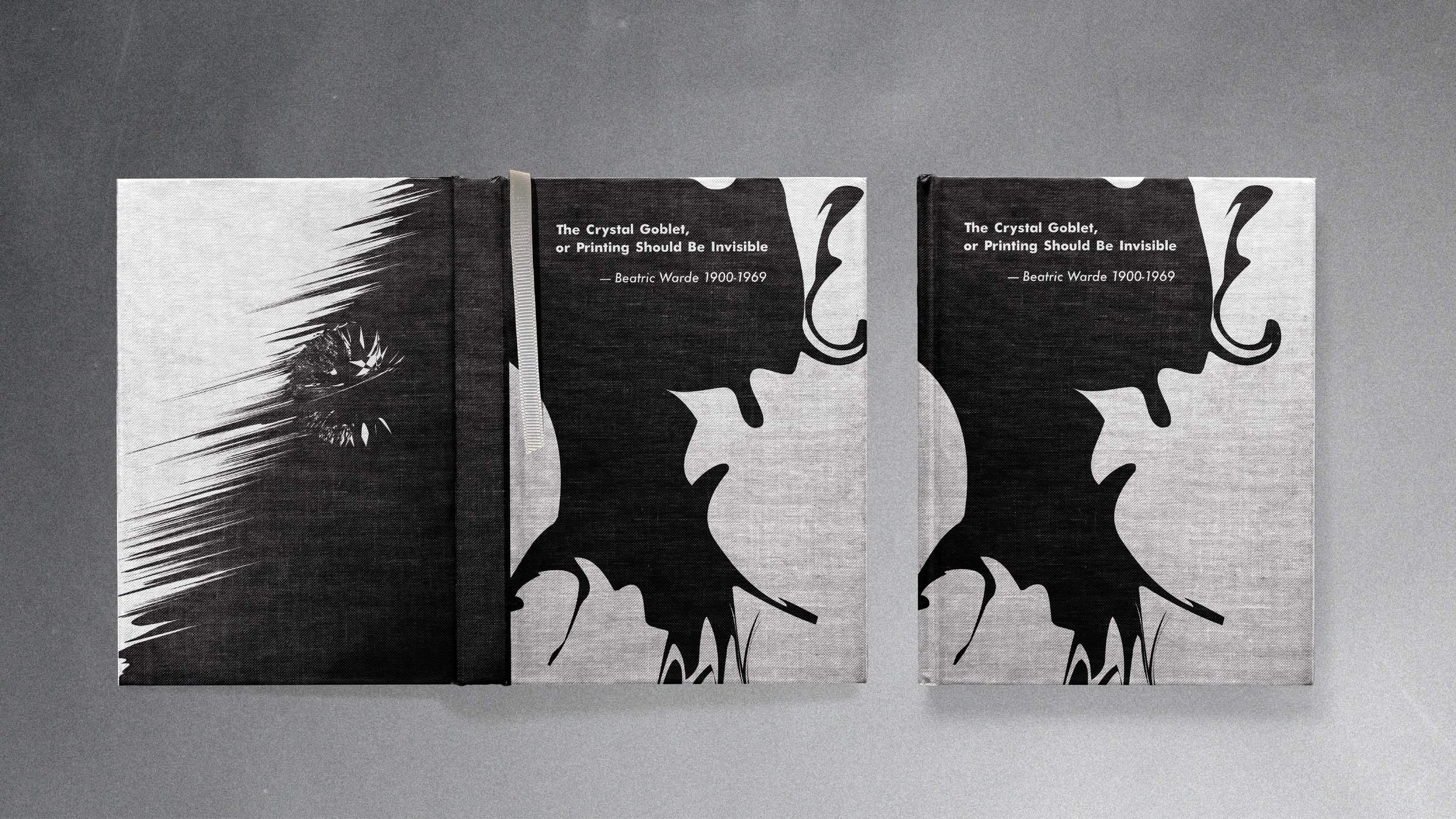
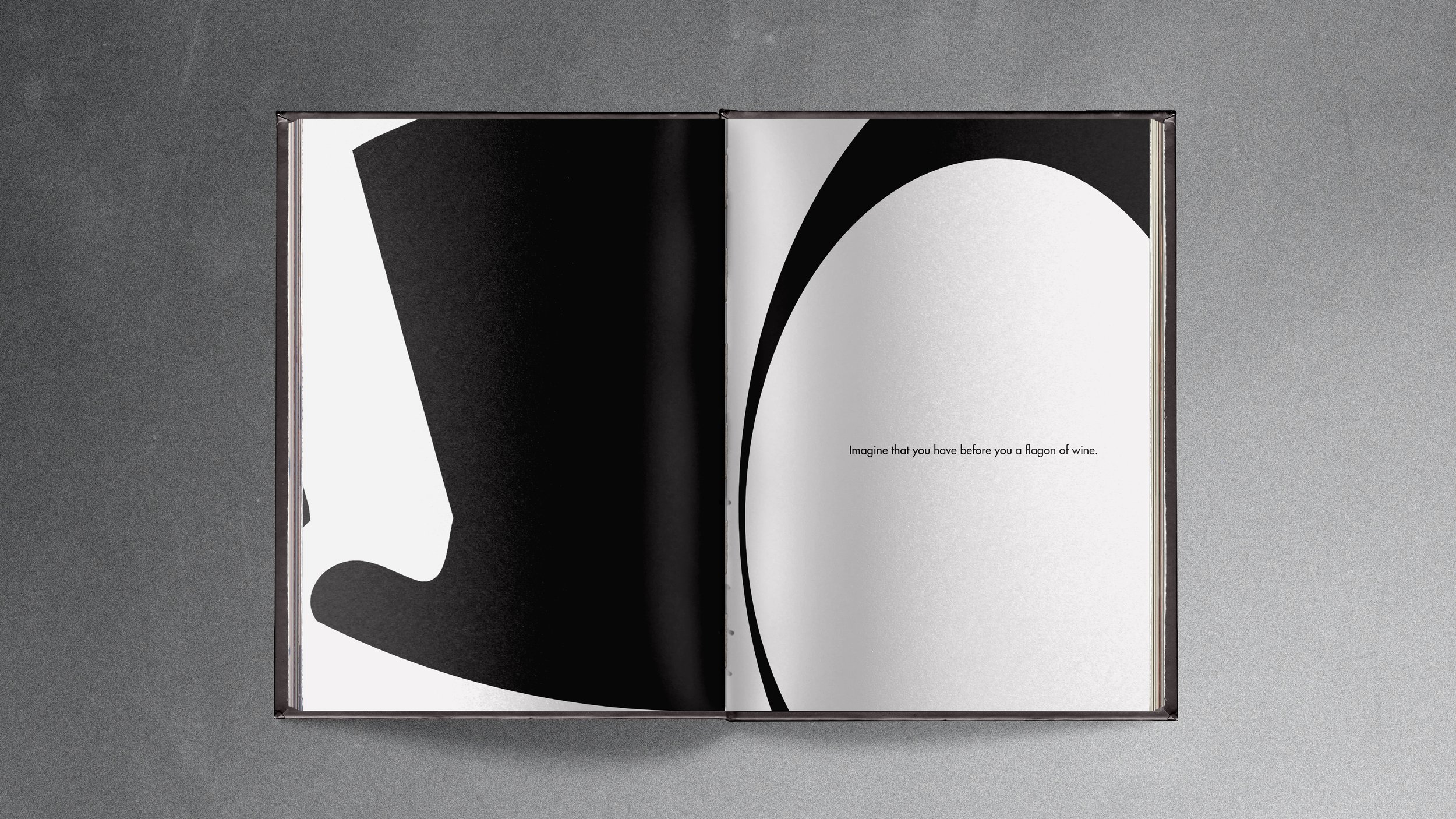
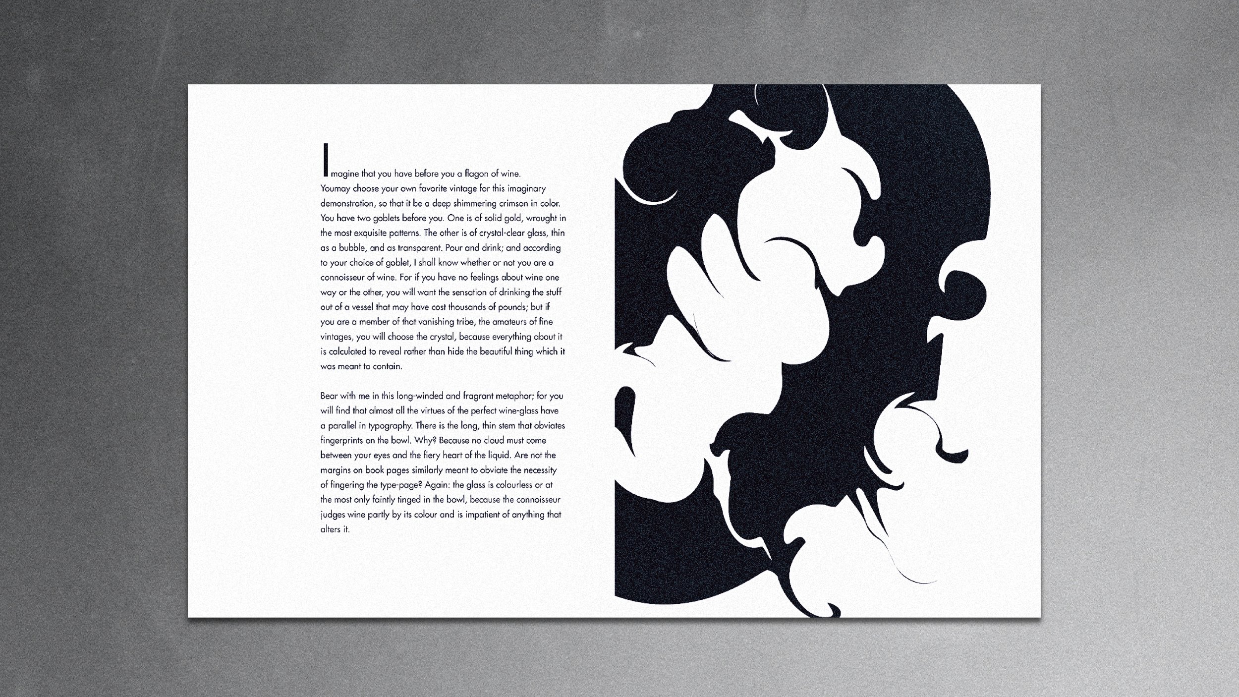
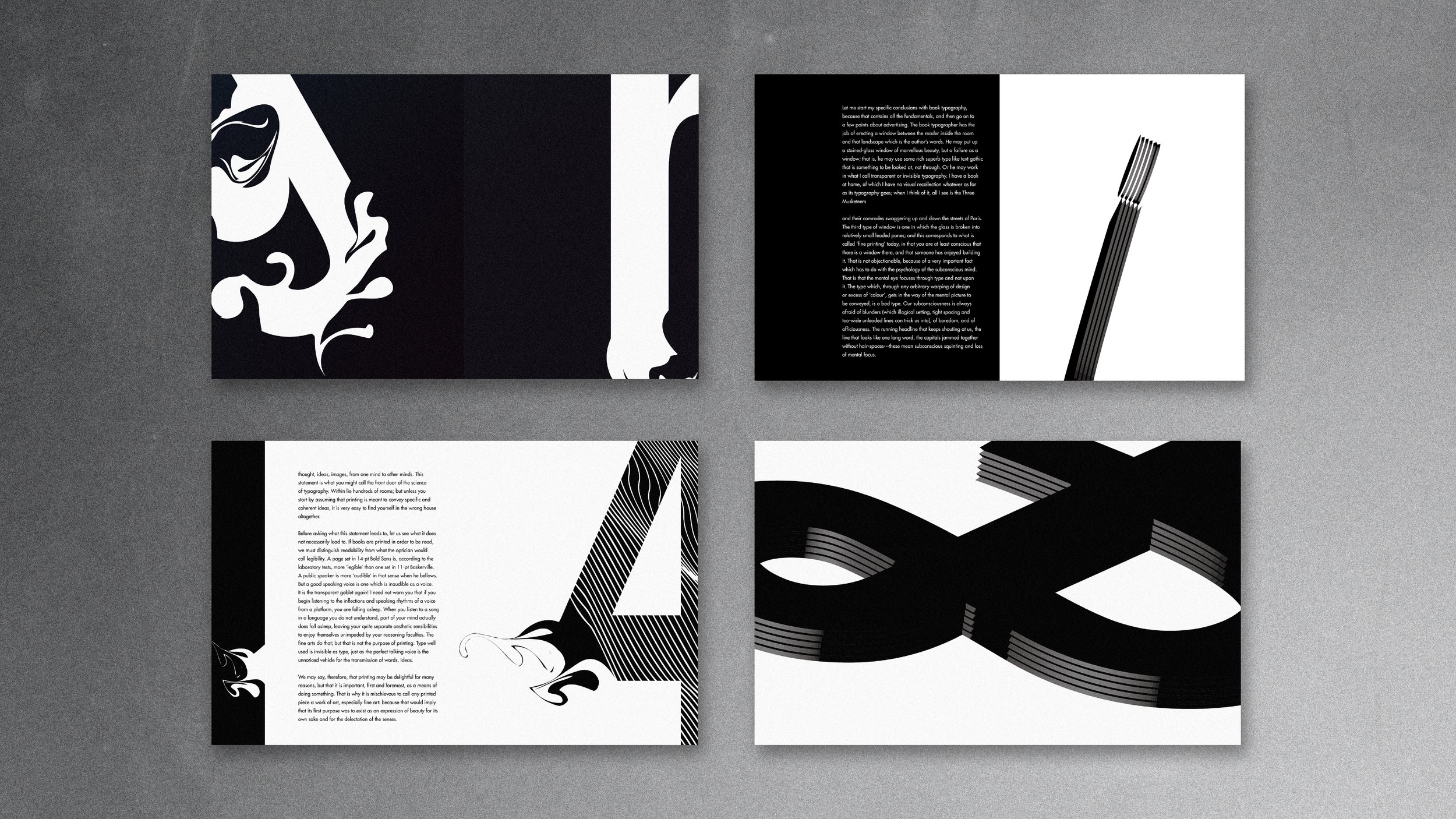
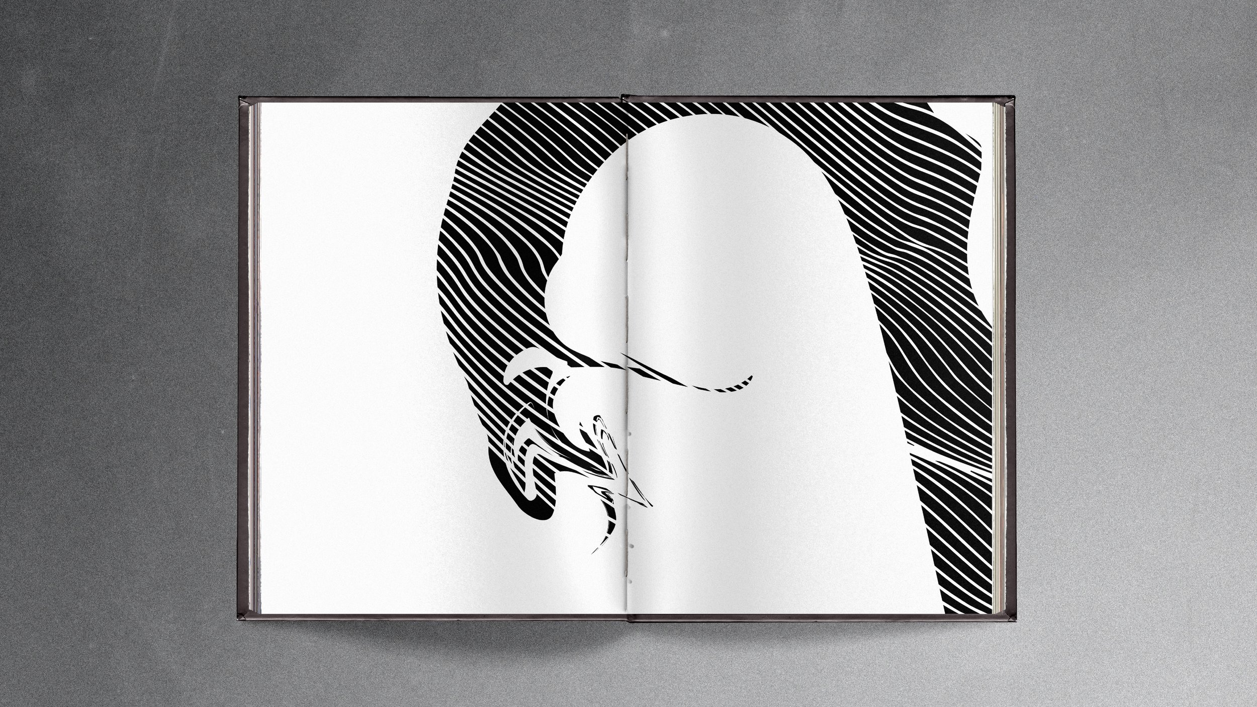
”The Crystal Goblet”
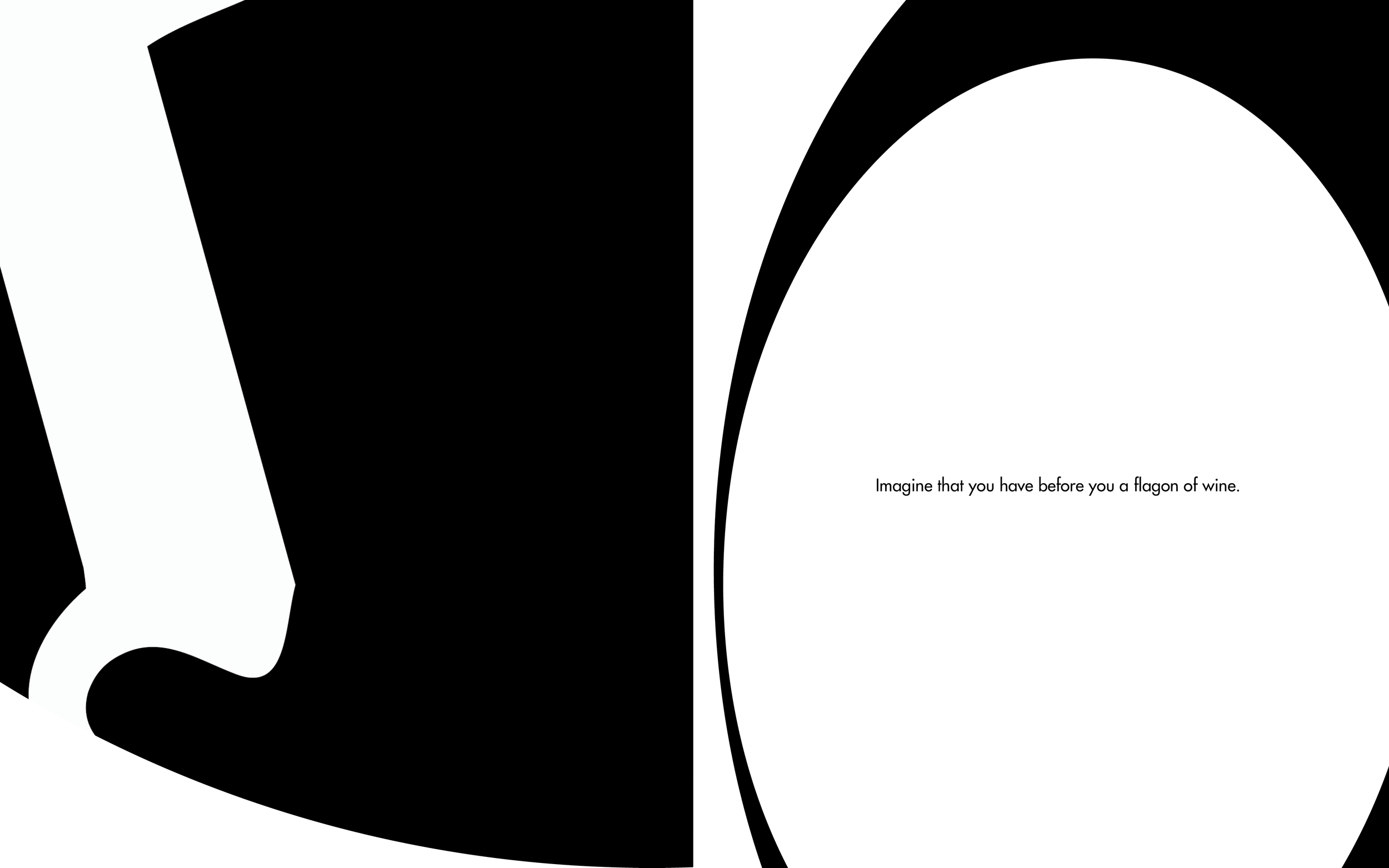
This is an editorial design of Beatrice Warde’s publication of “The Crystal Goblet”, which defines good typography as a crystal goblet, her address argues that the true art of designers is the creation of transparent interfaces which allow readers to imbibe deeply of the intellect captured within the pages of the book without external distractions.
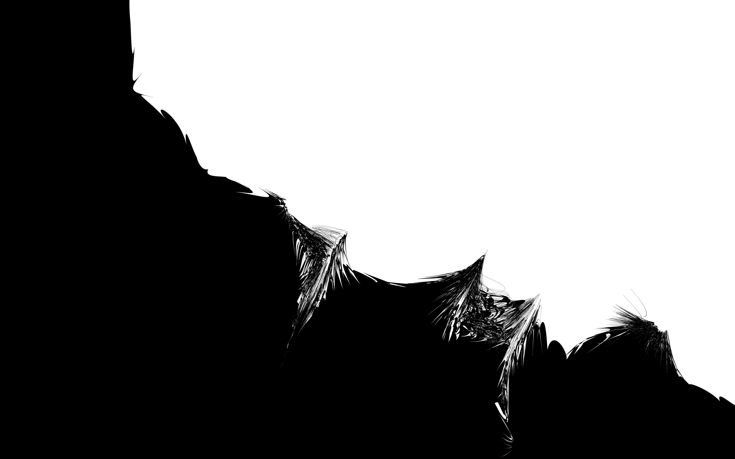
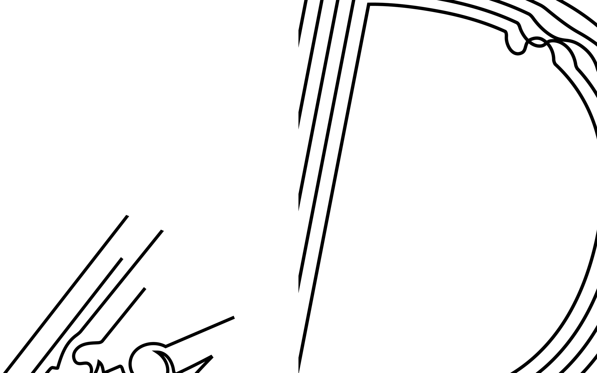
In the design, I use the Futura typeface in the book and feature different type transformations and show various visual compositions.
/2020
/Instructor: Philip Dibello
/Editorial Design











Collages & Drawings